Open
Description
Perceived Problem
- We have the wonderful concept of badges and I think users love this!
- Currently, each individual badge contains the same visual treatment so does not stand out, and currently they don't look like badges visually
- The description of a given badge can only be seen by hovering with the mouse and waiting for the alt text to appear, which is not obvious
- When a badge is achieved, the visibility of this to the user is low. We send an email which is great, but this should also be re-vamped
Ideas / Proposed Solution(s)
- Let's update the visual treatment so that each badge gets its own icon that matches the badge criteria and makes each one stand out
- Let's make it more intuitive to see a badge's description, I'm thinking that as a really simple design solution that might be slightly more intuitive and clear is to fade in/out the description on hover
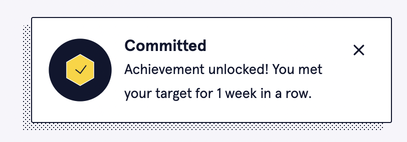
- Let's display a nice little Snackbar when the user earns the badge! See screenshot of an example
- Let's revamp the email design to include our overall aesthetic of the daily digest email but also to include the badge icon
Screenshots