-
|
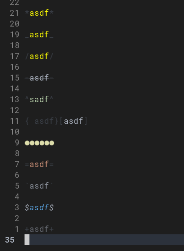
Not sure if this is expected, but some of the modifiers on my system look like this.
The first three, for example, are quite difficult to distinguish. Can I make them more usable? I am not sure where to look for - colorsheme, treesitter issues, fonts, etc. |
Beta Was this translation helpful? Give feedback.
Replies: 1 comment 3 replies
-
|
This should be a colorscheme issue as far as I can tell. |
Beta Was this translation helpful? Give feedback.
-
This seems correct, right? I installed some other colorschemes and they didn't work. But now I see why. If I change a colorscheme right inside neovim from the one that doesn't have this things set up to the one that does, bold and underline still don't work. So, I need a colorscheme with configured TSStrong, TSEmphasis and TSUnderline, right? |
Beta Was this translation helpful? Give feedback.
-
|
Or rather, how do I set it up myself? I didn't find any info in wiki. |
Beta Was this translation helpful? Give feedback.
-
|
This is correct |
Beta Was this translation helpful? Give feedback.
This should be a colorscheme issue as far as I can tell.
Can you try
:highlight NeorgMarkupItalic/Bold/Underline?if they all look the same (like the top three in the screenshot) then it's a colorscheme issue