One thing R is useful for is generating quick visualisations of your data. Here are some things to do to draw some:
A histogram is a chart which shows the distribution of values across a continuum: for example years, weights, heights, amounts of money, and so on. Note that this is different to a bar chart, which shows a comparison of amounts in different categories.
In the histogram below, for example, you can see the frequency distribution of different ages within a dataset (i.e. how often each age appears). It tells you that the most common ages to appear in the dataset are between 30 and 40.
The hist function generates a histogram from specified data.
Here's an example:
hist(moviesdata$revenue)
The data needs to be numeric or you will get an error saying Error in hist.default(YOURDATA) : 'x' must be numeric.
You can read more about histograms on this R-Bloggers post
A scatterplot is also a chart used to show distribution. It will plot each data point against an x and y value. For example, x might be weight, and y might be height; or x might be cigarettes smoked, and y might be age at death. The scatterplot above, for example, plots writing scores against reading scores.
As you can see from those two examples, it is often also used to indicate relationships: a scatterplot that shows a clear pattern, such as age of death going down as number of cigarettes goes up, is a good way of showing a relationship.
However, it is not proof of a relationship. Remember: correlation does not mean causation.
You can generate a scatterplot using plot in R like so:
plot(Movies$budget, Movies$domgross)
Here we have specified two numeric columns in our data frame (in this case, budget spent vs domestic gross).
The Nathan Yau tutorial on getting started with charts in R goes into more detail and covers some of the charts mentioned below too.
You can also use plot to generate multiple scatterplots showing all relationships between variables in your dataset (see example above). In this case just put the name of the dataset like so:
plot(movies)
This works best when a) you don't have too many columns and b) most columns are numeric.
You can read more about scatterplots and scatterplot matrices on this Quick-R post, which also details some other functions.
A box and whiskers chart - or boxplot - is another way of showing distribution. The 'box' shows the range within which the middle half of numbers fall: in other words, the lower and upper quartiles. The line through the middle of the box shows the median: in other words, the point at which half of your numbers are higher, and half are lower.
Reaching out from the box are two lines called 'whiskers'. These show you the range of numbers: the highest and lowest ones. This explanation from BBC Bitesize is useful in explaining them
You create these with the boxplot function, like so:
boxplot(mydata)
This will create a box and whiskers chart for each column in the dataset. But you can also generate for one column like so:
boxplot(Movies$budget)
Or for specified columns like so:
boxplot(Movies$budget, Movies$gross)
You'll notice that all the examples above relate to distribution. To show a comparison you need a bar chart, and this involves a little extra work.
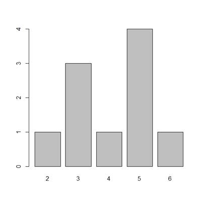
The function to create a bar chart is barplot, but to use that we first need to create a vector which has a count of the number of items in each category we want to compare (even if the category is a number).
That function is table. Use it like so:
years <- table(Movies$year)
And then use that variable with barplot like so:
barplot(years)
You can find a more in-depth tutorial that adds other features here. You should also, strictly speaking, order bars from largest to smallest in a bar chart. So here's a challenge: find out how to do that (tip: you might need a different function from a package like ggplot).
I can't ignore the most obvious chart any longer. Yes, you can create pie charts in R, with the function pie.
Pie charts should always be considered carefully: firstly, they are harder to interpret than rectangular chart types like treemaps and bar charts. Secondly, they should always be used to show composition: in other words, parts of a whole. And all parts should add up to 100%.
You can create a pie chart from one numerical vector, like so:
parts <- c(50, 25, 10)
pie(parts)
...but it's not must use: the pie chart will assume the 'pie' is the total of all numbers in the vector, and slice it up accordingly, but it will not have any labels.
To add labels you can create another vector containing those, and add that as the labels= parameter in your command like so:
parts <- c(50, 25, 10)
partlabels <- c('defence', 'health', 'welfare')
pie(parts, labels=partlabels)
A quicker approach is to use the table function again: this not only creates the numbers (counts of categories from a particular column) but also the labels (the categories themselves).
years <- table(Movies$year)
pie(years)
You can read more on how to create a pie chart and change settings and labels, etc. in this post on Quick-R but please, please never create a 3D pie chart: these actively distort the sizes of slices and make it even harder to understand still.
If you need to use a pie chart to show composition, consider using a treemap instead. These are easier to interpret visually and also allow users to see a greater level of detail in terms of categories and sub-categories.
This tutorial from Flowing Data explains how to create a treemap using the package Portfolio
Alternatively, you can use the Treemap package, outlined on RPubs here
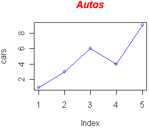
Line charts are essentially very similar to scatterplots: you use the plot function to plot each data point as a dot, with the difference that each dot needs to be connected with a line.
To do that, you need to add an extra type= parameter that specifies "l" (l for line):
plot(parts, type="l")
However, if you want more than one line, it starts to get complex.
The Frank McCown tutorial Producing Simple Graphs with R breaks it down particularly well, and moves on to other types of charts too. Tutorials Point also has a tutorial on line charts in R.
Christophe Ladroue has a post on creating a polar histogram in R using the ggplot package. This is very pretty, but remember that circular charts like this and pie charts tend to be much harder for people to interpret than standard histograms and bar charts.
You can find more resources on visualisation using R in the vis folder of this repo


