Add configurable section to results page for optional tools #2429
Description
This ticket is prompted by current work in Spotlight on a bulk actions feature, where we're adding a new button for Spotlight exhibit curators to perform actions on search results. Because we already have one curator action on the Spotlight search results page (Save this search) and we're adding another one (Bulk actions), there isn't room to display the buttons for these actions in the same row as the standard search result navigation and display option controls (sort, per-page, etc.) at some viewport widths without things looking pretty ugly.
At @mejackreed's suggestion, we're recommending an update to Blacklight to move optional search result actions to a new row, that could be configurable depending on whether the application needs to display it or not, above the current end-user visible result controls:
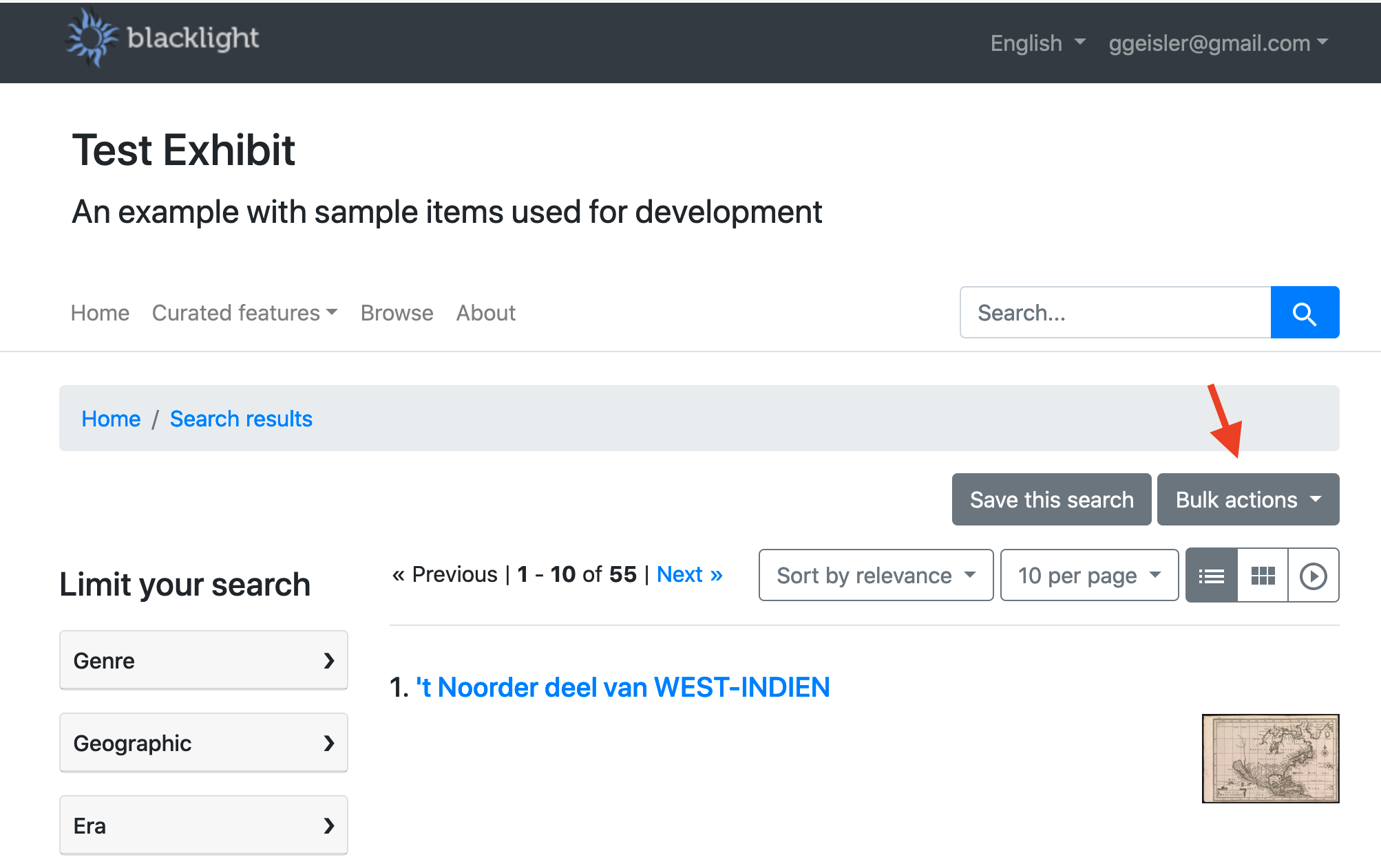
The mockup above is for Spotlight, but I think one reason for doing this in Blacklight is so other Blacklight-based apps could follow this pattern if they had similar optional result actions to display (there might be other technical reasons I didn't catch in my discussion with @mejackreed).
-
Add a new row (
<div class="row"><div class="col-md-12">) directly above the current search result controls. (The “Save this search” button already wraps awkwardly at theLGbreakpoint and below so a new row would fix that plus support the new button. This entire row could then be rendered only for curators, I believe.) -
Controls in this new row should be right-aligned in the row
-
Controls in this new row should use similar horizontal spacing between as the search result controls in the row below
(I'm not sure the latter two to-dos above are relevant to the Blacklight part of this? And I believe @mejackreed noted that config.add_results_collection_tool is relevant here in some way.)