Releases: puckeditor/puck
v0.14.2
Puck v0.14.2 addresses numerous stability issues and significantly improves loading performance for iframes.
Changelog
Bug Fixes
- add DropZone iframe compatablity mode for bug in Safari 17.2, 17.3 and 17.4 (47496c2)
- check for optionality to handle race condition when dragging (4dbd487)
- defer iframe event binding until contentWindow is ready (268ea53)
- don't crash if component is missing after referenced in category (dc93789)
- don't force height of DropZones in custom interfaces (046c255)
- don't query iframe document if not ready (2b2ef32)
- don't throw undefined error if rapidly zooming browser in some environments (282a8b0)
- fix drag-and-drop when entire Puck component used inside an iframe (23db292)
- fix support for boolean values in select fields (c4a66ad)
- make draggable outlines consistent (9008b70)
- prevent grid layout issues in generated apps (5c05f94)
- reflect value changes made via resolveData in radio fields (9a7066f)
- remove peer dependencies causing warnings (041ca64)
- resolve security warning when additional iframes present (03ab0bd)
- use 100% width for Puck preview when iframe disabled (#414) (64303c8)
- use more custom interface friendly styles for iframes (e6e01c6)
Performance Improvements
- add API for disabling auto-scroll due to performance issues (3e5599e)
- batch load initial iframe styles (e585f20)
- don't lock main thread when iframe styles changed (e529e85)
- reuse host window styles in iframes (e7fe7e0)
New Contributors
Full Changelog: v0.14.1...v0.14.2
Contributors
Assets 2
v0.14.1
v0.14.0
Puck v0.14.0 introduces the long awaited viewport switching feature, with drag-and-drop-friendly iframe rendering for full CSS media query support.
TLDR
- Viewport switching: Render your entire Puck preview inside an iframe for full CSS media query support. Override the viewports using the
viewportsAPI. - New field APIs: Array and number fields now accept
min/maxparams, and external fields can now render search filters using the familiarfieldsAPI. - New component label API: Provide a custom label to use as your component name.
- Contentful field package: Easily load your Contentful content into Puck with this pre-configured field.
- Color, accessibility and keyboard improvements: A new 12-tint color palette for improved contrast, amongst various other accessibility fixes.
Highlights
📱 Viewport switching
Puck now supports viewport switching with full iframe rendering, without compromising the drag-and-drop experience. This was a significant effort that required patching the underlying drag-and-drop library to support iframes and CSS transforms, and introducing a new library for syncing styles between host and iframe.
Puck.Viewport.Switching.mp4
Viewports are enabled by default, and can be customized by passing an array to the viewports API.
import { Puck } from "@measured/puck";

export function Editor() {
  return (
    <Puck
      viewports={[
        {
          width: 1440,
          height: "auto", // Optional height. Can be numeric or "auto". Defaults to "auto".
          label: "My Viewport", // Optional. Shown in tooltip.
          icon: <svg />, // Optional. Use lucide-icons to align with Puck UI.
        },
      ]}
      // ...
    />
  );
}
🔢 New field APIs
Both number and array fields now accept min and max parameters, allowing you to control the minimum and maximum values (or number of values) for user input. Thanks to @jabba-the-bug and @jperasmus for their contributions.
const numberField =  {
  type: "number",
  max: 10,
};
The new filterFields API on external fields allows you to render filters that are provided to your fetchList method using the familiar fields API.
const externalField = {
  type: "external",
  fetchList: async ({ filters }) => {
    // Query content and apply filters
  },
  filterFields: {
    rating: {
      type: "number", // Render a number field
    },
  },
},
🔡 New component label API
Customize the name of your component with the new label API. Thanks to @bwat-dev for contributing this feature.
const config = {
  components: {
    HeadingBlock: {
      label: "Heading Block",
      render: () => <h1>Hello, World</h1>,
    },
  },
};
Contentful field package
Use the new field-contentful package to load content out of your Contentful space.
NB An issue occurred publishing @measured/[email protected]. We will be introducing @measured/[email protected] soon to address this.
import createFieldContentful from "@measured/puck-field-contentful";

const config = {
  components: {
    Example: {
      fields: {
        movie: createFieldContentful("movies", {
          space: "my_space",
          accessToken: "abcdefg123456",
        }),
      },
      render: ({ data }) => {
        return <p>{data?.fields.title || "No data selected"}</p>;
      },
    },
  },
};
Breaking changes
iframes are enabled by default
Viewport rendering with iframes is enabled by default. If you need to disable this, you can pass iframes={{ enabled: false }} to the Puck component.
Changelog
Features
- add "name" prop to componentItem override (45bbceb)
- add
minandmaxAPIs to array fields (53b7937) - add API to opt-out of iframes (03dd90b)
- add Contentful field package (d944288)
- add filter fields to ExternalFields (7a55053)
- add iframe support (1d0bf57)
- add
minandmaxAPIs to number fields (4932a6e) - add
selectedItemconvenience param to usePuck (c1224d0) - add viewport switching (ccf9149)
- enable mapping of table rows in external fields (d50c56e)
- expose history via usePuck hook (1b907cb)
- hide array Add button when array is readOnly (4e27c3f)
- improve touch, contrast & keyboard a11y (f975d87)
- refine UI for external field modal (6a2afa1)
- support custom component labels via the new label param (712fb8e)
- update to 12-tint color palette (d43da58)
- use InterVariable font (88532fb)
Bug Fixes
- avoid FOUC of side bars on mobile (83be956)
- correctly infer objectFields type from props (e8991cc)
- don't attempt to resolve data if component missing from config (cc7d391)
- don't flash nested DropZones on first drag (38c3dc4)
- don't unexpectedly show DropZone background (2001fa2)
- ensure font loads for ExternalFields (e9bca75)
- ensure heading-analyzer updates when content changes (d75df7a)
- ensure select and radio fields support read only arrays (cbdf66d)
- fix array field when used on root (95280e6)
- fix renderDropZone method in editor (2c738dd)
- lower opacity of DropZone background to support dark backgrounds (9a5c0b8)
- make getItemSummary optional on ExternalFields, as expected (26bc4ff)
- only import Puck CSS on editor pages (22a4182)
- prevent unexpected field behaviour when pressing "Enter" key (bf4f527)
- use strict return type for resolveData (777cd3c)
- vertically align field icons (fa92436)
New Contributors
- @jperasmus made their first contribution in #306
- @nguyendhst made their first contribution in #338
- @prashanthvdckap made their first contribution in #342
- @jabba-the-bug made their first contribution in #341
- @mfakhrys made their first contribution in #370
- @hjbrand made their first contribution in #368
- @bwat-dev made their first contribution in #367
- @jonduarte made their first contribution in #375
Full Changelog: v0.13.1...v0.14.0
Contributors
Assets 2
v0.13.1
v0.13.0
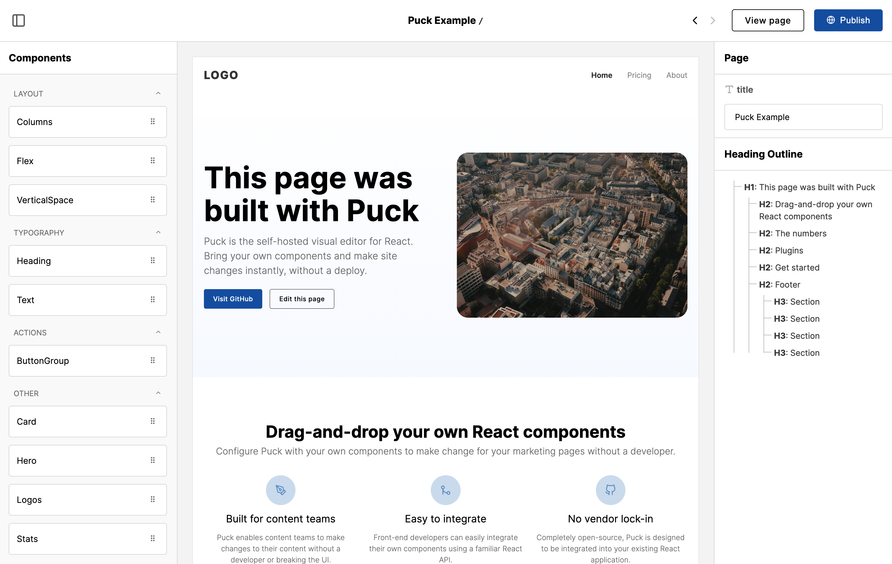
Puck v0.13.0 introduces some of our most powerful APIs yet, enabling completely custom interfaces, adding support for object fields and mechanisms to restrict DropZones.
TLDR
- Custom interfaces: Take complete control of the Puck UI with the new custom interface APIs.
- Object fields: Represent objects as fields with the new
objectfield type. - DropZone restrictions: The new
allowanddisallowprops allow you to restrict which components can be dropped into DropZones. - New plugin API (Breaking Change): The plugin API has been updated to align with the new custom interfaces API. This is a breaking change. The plugin API remains experimental.
- New transformProps API: The new transformProps API makes it easier to rename props on your components without breaking your payload.
- New
uiprop: Set the initial UI state for the Puck editor on render. - Add search to external fields: Show a search input in the
externalfield modal, enabling the user to query your external API.
Highlights
🎨 Custom interfaces
It's now possible to create completely custom Puck interfaces to integrate more deeply with your own UI and create a seamless experience for your users.
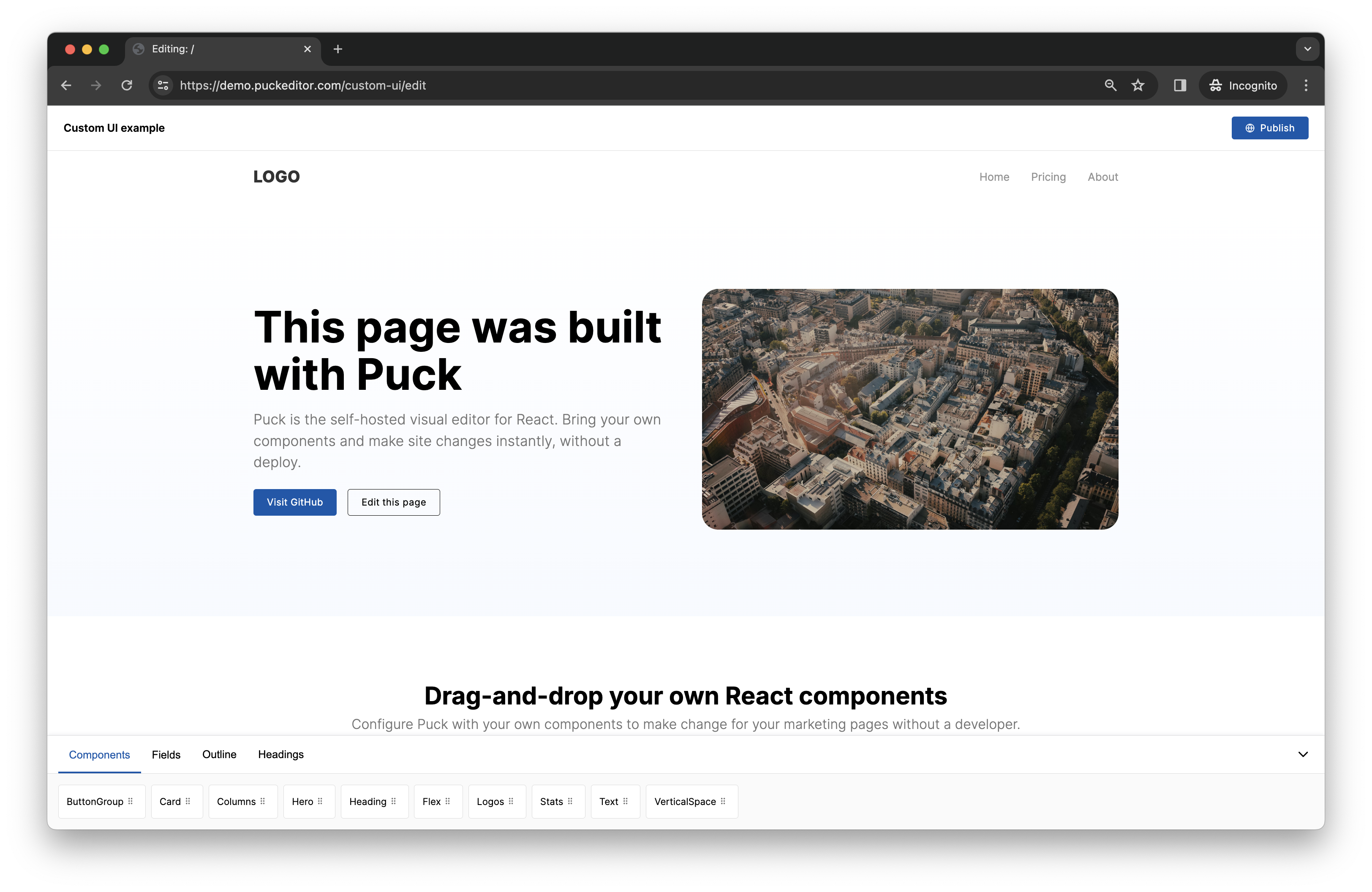
This can be achieved by passing children to the <Puck> component.
import { Puck } from "@measured/puck";

export function Editor() {
  return (
    <Puck>
      <div style={{ background: "hotpink" }}>
        <Puck.Preview />
      </div>
    </Puck>
  );
}
See demo.
🪝 The usePuck hook
Access Puck's internals using the usePuck hook to extend Puck's functionality with powerful custom components.
import { Puck, usePuck } from "@measured/puck";

const JSONRenderer = () => {
  const { appState } = usePuck();

  return <div>{JSON.stringify(appState.data)}</div>;
};

export function Editor() {
  return (
    <Puck>
      <JSONRenderer />
    </Puck>
  );
}
🗃️ Object fields
Object fields enable you to represent your object types with the fields API. No more flattening your props!
const config = {
  components: {
    Example: {
      fields: {
        params: {
          type: "object",
          objectFields: {
            title: { type: "text" },
          },
        },
      },
      render: ({ params }) => {
        return <p>{params.title}</p>;
      },
    },
  },
};
🙅 DropZone restrictions
Restrict which components can be passed into a DropZone component with the allow and disallow props.
const MyComponent = () => (
  <DropZone zone="my-content" allow={["HeadingBlock"]} />
);
Deprecations
renderHeader deprecated
The renderHeader prop has been deprecated in favor of the overrides API.
// Before
export function Editor() {
  return (
    <Puck
      renderHeader={({ appState, dispatch }) => ()}
    />
  );
}

// After
export function Editor() {
  return (
    <Puck
      overrides={{
        header: ({ appState, dispatch }) => ()
      }}
    />
  );
}
renderHeaderActions deprecated
The renderHeaderActions prop has been deprecated in favor of the overrides API.
// Before
export function Editor() {
  return (
    <Puck
      renderHeaderActions={({ appState, dispatch }) => ()}
    />
  );
}

// After
export function Editor() {
  return (
    <Puck
      overrides={{
        headerActions: ({ appState, dispatch }) => ()
      }}
    />
  );
}
Breaking changes
renderComponentList removed
The renderComponentList prop has been removed in favor of the overrides API.
// Before
export function Editor() {
  return (
    <Puck
      renderComponentList={({ appState, dispatch }) => ()}
    />
  );
}

// After
export function Editor() {
  return (
    <Puck
      overrides={{
        componentList: ({ appState, dispatch }) => ()
      }}
    />
  );
}
Plugin API revamped
The plugin API has been significantly revamped to match the overrides API.
// Before
export function Editor() {
  return (
    <Puck
      plugins={[
        { renderFields: ({ appState, dispatch }) => () }
      ]}
    />
  );
}

// After
export function Editor() {
  return (
    <Puck
      plugins={[
        overrides: {
          form: ({ appState, dispatch }) => ()
        }
      ]}
    />
  );
}
Changelog
Features
- add "ui" prop to Puck to set the initial state (71f8b2f)
- add APIs to restrict components dropped in DropZones (28f24f9)
- add data migration API (f987324)
- add generic Config type to Puck and Render components (1c4b97f)
- add object field type (243278b)
- add Puck class to outer div (0698a12)
- add search to external fields (fe3b439)
- add transformProps lib to migrate component props (1ec2a78)
- add usePuck hook (13f3ccb)
- introduce UI overrides API (8a7c325)
- make onPublish prop optional (60f317f)
- remove renderComponentList in favour of overrides API (97f65e3)
- replace existing plugin API with plugin overrides (46cca26)
- support compositional Puck (22f053f)
- track isDragging in app state (841ae12)
Bug Fixes
- don't crash when loading external data into array field items (d13d00b)
- enable user to pass in config without casting (ee211e2), closes #185
- fix broken nested array fields (7a3949f)
- fix initial UI state on mobile (3aa0057)
- prevent pollution of global styles into component overlay (3fcf8e3)
- record history when a user selects an item (3a649c9)
- remove packages triggering superficial security warning (0f52b61)
- respect label in radio fields (fe550d7)
- set aria-label on all loaders (9adca27)
- stop color pollution in external field modals (2e1b5ef)
- use correct title path in recipes (60244ba)
- watch puck.config.tsx in Remix recipe (ecb276c)
New Contributors
- @anglepoised made their first contribution in #295
- @danielbayley made their first contribution in #285
Full Changelog: v0.12.0...v0.13.0
Contributors
Assets 2
v0.12.0
The Puck docs now live at https://puckeditor.com/.
Summary
This release introduces support for React Server Components (thanks @4leite), makes huge improvements to responsive behaviour (🙇♂️ @monospaced) and introduces a Remix recipe (ty @earthlingdavey).
⚡️ React Server Components
Puck now supports React server components via the included @measured/puck/rsc bundle. You should import Render from this bundle instead of the main bundle if you need to support RSC:
import { Render } from "@measured/puck/rsc";

export function Page() {
  return <Render config={config} data={data} />;
}
Docs: https://puckeditor.com/docs/integrating-puck/server-components
📱 Responsive Improvements
Puck now behaves much better on small viewports! We’ll continue to iterate on this experience.
✨ Remix Recipe
The new Remix recipe enables you to generate a Remix Run v2 application configured with Puck.
💅 New CSS imports
You can now import your CSS directly from the Puck package, instead of reaching into dist. This is backwards compatible.
@import "@measured/puck/puck.css";Changelog
Features
- support React server components via @measured/puck/rsc bundle (90ac161)
- add explicit rsc and css exports (0b6a527)
- improve responsive behaviour (889b4c7)
- add visibility toggle for right-hand sidebar (3d6c5d4)
- allow custom fields to set UI state during onChange (388793c)
- expose field "id" to custom fields (849161e)
- improve IconButton accessibility (4c71d39)
- add new monospaced font stack (c484ea6)
- tweak Field input focus state (8012afd)
Bug Fixes
- don't enable style pollution of input background color (bb1a76b)
- don't reset array item labels when changing order (57563e1)
- ensure field icon and label are vertically aligned (caa40e0)
- ensure root render receives props from latest data API (abb6ff1)
- export missing PuckAction type (f22f32d)
- fix rootResolver behaviour when using recommended root data API (5c13de5)
- migrate to @hello-pangea/dnd to fix defaultProps warning (2c97362)
- prevent inconsistent default input font-size (99f90b3)
- show a default value when no placeholder set on external fields (e30b5b6)
- stop
zonesgetting wiped out if data prop updated (0c4514f) - stop style pollution into array field items (03b89d5)
- stretch external field table to width of modal (f6d89f6)
- use correct root data API in next recipe example database (b598144)
- use Inter font in button type Buttons (1973847)
Full Changelog: v0.11.0...v0.12.0
New Contributors
- @4leite made their first contribution in #197
- @monospaced made their first contribution in #230
- @earthlingdavey made their first contribution in #227
Contributors
Assets 2
v0.11.3
Bug Fixes
- ensure field debounce doesn't sporadically lock preview update (487ab83)
- stop generator crashing on Windows due to commits with single quotes (ab9d43f)
New Contributors
@ahmedrowaihi made their first contribution in #218
Full Changelog: v0.11.2...v0.11.3
Contributors
Assets 2
v0.11.2
v0.11.1
v0.11.0
v0.11.0 - Categories and dynamic props
Summary
This release introduces new APIs for categories and dynamic prop resolution, and updates the Next.js recipe to render static pages.
Categories API
The categories API enables the user to group their components in the left side bar.
Users can configure categories using the new categories configuration on the Puck config. They can also override this behaviour by using the renderComponentList API, accessible via the Puck root or plugins.
  categories: {
    layout: {
      components: ["Columns", "Flex", "VerticalSpace"],
    },
    typography: {
      components: ["Heading", "Text"],
    },
    interactive: {
      title: "Actions",
      components: ["ButtonGroup"],
    },
  },
Dynamic prop resolution
Dynamic prop resolution is an extremely powerful feature that enables developers to dynamically change props after the user has changed them. Full documentation available in the README.
This can be paired with external fields to query data from a third-party API, and also allows you to set fields as read-only.
const config = {
  components: {
    HeadingBlock: {
      fields: {
        heading: {
          type: "text",
        },
        title: {
          type: "text",
        },
      },
      resolveData: async (props) => {
        return {
          props: {
            title: props.heading, // map `heading` to `title`
          },
          readOnly: {
            title: true, // make `title` read-only
          },
        };
      },
      render: ({ title }) => {
        return <h1>{title}</h1>;
      },
    },
  },
};
Next.js recipe now supports static rendering
The default Next.js recipe has been updated to support static rendering, enabling Puck to generate static pages.
If you’ve already generated from this recipe and want to enable static rendering, we recommend manually updating your code to follow the latest best practices.
Deprecations
This release includes various backwards-compatible deprecations that will be breaking in a future release.
Deprecate use of props under root in Puck data in favour of root.props (7593584)
This affects all existing data payloads that make use of root. This allows us to align the behaviour of root with other components, including the new resolveData API.
Migration
Before
{
  "root": {
    "title": "Hello, world"
  }
}
After
{
  "root": {
    "props": {
      "title": "Hello, world"
    },
  }
}
We may consider making this permanently backwards compatible via the transformers proposal.
Deprecate adaptor in favour of new external field APIs (7f13efc)
The adaptor API on external field types has been removed in favour of keeping them at the root of the field configuration.
Migration
Before
{
  myField: {
    type: "external",
    adaptor: {
      name: "External Source",
      fetchList: () => {}
    }
  }
}
After
{
  myField: {
    type: "external",
    placeholder: "Select from External Source",
    fetchList: () => {}
  }
}
Deprecate magic _data API in favour of resolveData (4ee31e7)
The magic _data field name previously allowed you to spread the result of your adaptor call across your object. This has been replaced in favour of resolveData.
Migration
Before
{
  fields: {
    _data: {
      type: "external",
      adaptor: {
        name: "External Source",
        fetchList: () => {
          return [{ title: "Hello, world" }];
        },
      },
    },
    title: {
      type: "text",
    },
  },
};
After
{
  fields: {
    data: {
      type: "external",
      // Also note adaptor API change
      placeholder: "Load from external Source",
      fetchList: () => {
        return [{ title: "Hello, world" }];
      },
    },
    title: {
      type: "text",
    },
  },
  resolveData: ({ props }) => ({ props: { ...props, ...props.data } }),
};
Features
- add categories API for grouping components in side bar (594cc76)
- add read-only states to all field types (746d896)
- add icon to external fields (a3a018b)
- add loading state to external field modal (5b4fc92)
- add lock icon when field is read-only (a051000)
- add mapProp API to external fields (86c4979)
- add renderComponentList API (ec985e3)
- add resolveData API for modifying props dynamically (c1181ad)
- deprecate adaptors in favour of new external field APIs (7f13efc)
- deprecate magic adaptor _data behaviour in favour of resolveData API (4ee31e7)
- deprecate props under root in favour of
root.props(7593584) - make external field more consistent with other fields (5bfbc5b)
- update next recipe to render to static (a333857)
Bug Fixes
- don't flicker root DropZone when dragging (358435c)
- ensure array fields can render if value is undefined (47ab3c9)
- isolate external field modal from high z-indexes (fdf97c7)
- make Field types required based on type (daf36ac)
- prevent global style pollution in external fields (429731d)
- prevent long header titles from rendering over actions (4613df4)
- use correct heading component for external inputs (462266d)
Performance Improvements
- cache data between fetchList calls in external fields (04b7322)
- improve render performance of fields (d92de7f)
New Contributors
- @sagarchoudhary96 made their first contribution in #180
Full Changelog: v0.10.0...v0.11.0