Description
In my work and daily life, I frequently adjust video progress bars, but each adjustment feels cumbersome: progress bars are typically only about a dozen pixels tall, requiring significant effort to position the mouse precisely within this narrow range. This also shifts my focus from the video content to the player controls, creating a poor user experience.
To solve this, I designed the Invisible Overlaid Control Area.
Try my demo here:
https://willhancn.github.io/video-invisible-overlaid-control-area-demo/demo.html
You'll immediately notice how much more comfortable and effortless it feels to adjust or drag the progress bar. Your attention stays focused on enjoying the video content rather than wrestling with UI controls.
Core design principles:
- Expanded control area: A 10px-tall progress bar requires ~100 units of user effort to target, while a 300px-tall area reduces this to ~1 unit
- Only the interactive area expands - the visible UI remains unchanged to avoid obscuring content, with cursor changes indicating the invisible zone's functionality
- Persistent tooltip display within the control area: Allows peripheral awareness of seek targets, enabling subconscious adjustments while consciously enjoying content
The demo showcases two designs - I personally prefer the first, but supporting multiple styles would benefit users.
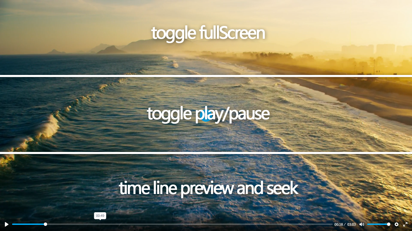
Further development revealed that multiple Invisible Overlaid Control Areas could coexist. My demo implements three vertically stacked areas:
- Toggle fullscreen
- Toggle play/pause
- Timeline preview and seek
Current "clickToPlay" implementations represent the minimal case with just one area (play/pause).
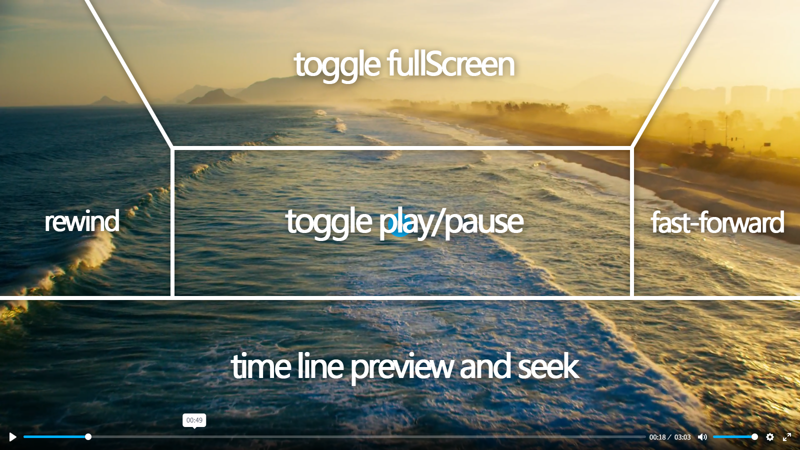
More radically, non-rectangular control areas show promise:
Side panels could enable rewind/fast-forward or custom actions like "previous/next video"
Custom areas could be implemented via HTML injection (similar to Plyr's custom controls: https://github.com/sampotts/plyr/blob/master/CONTROLS.md#using-custom-html)
Disclaimer: As a non-professional frontend developer, this demo merely illustrates the concept for personal use. Significant compatibility issues exist:
- Limited testing with previewThumbnails
- Crude fullscreen listener implementation
- Complete UI breakdown when plyr.source is set
- Other bugs (e.g., missing initial mouseenter event)
Summarize
The UX improvement is profound - after using this, traditional players feel as outdated as Nokia phones compared to iPhones. I believe this design could:
- Become Plyr's default setting one day
- Save humanity millions of collective hours annually
- Give Plyr significant competitive advantage
Hoping to see this implemented properly someday. Thanks and respect to the Plyr team.