Input box components TextFieldand form components are provided in the Material component library Form. Let's introduce them separately below.
TextFieldUsed for text input, it provides many attributes. Let's briefly introduce the function of the main attributes, and then demonstrate the usage of key attributes through a few examples.
const TextField({
 ...
 TextEditingController controller,
 FocusNode focusNode,
 InputDecoration decoration = const InputDecoration(),
 TextInputType keyboardType,
 TextInputAction textInputAction,
 TextStyle style,
 TextAlign textAlign = TextAlign.start,
 bool autofocus = false,
 bool obscureText = false,
 int maxLines = 1,
 int maxLength,
 bool maxLengthEnforced = true,
 ValueChanged<String> onChanged,
 VoidCallback onEditingComplete,
 ValueChanged<String> onSubmitted,
 List<TextInputFormatter> inputFormatters,
 bool enabled,
 this.cursorWidth = 2.0,
 this.cursorRadius,
 this.cursorColor,
 ...
})
-
controller: The controller of the edit box, through which you can set/get the content of the edit box, select edit content, and monitor edit text change events. In most cases, we need to explicitly provide onecontrollerto interact with the text box. If not providedcontroller, oneTextFieldwill be automatically created internally. -
focusNode: Used to controlTextFieldwhether to occupy the input focus of the current keyboard. It is a handle for us to interact with the keyboard. -
InputDecoration:TextFieldAppearance display for control , such as prompt text, background color, border, etc. -
keyboardType: Used to set the default keyboard input type of the input box, the values are as follows:
TextInputType enumeration value
meaning
text
Text input keyboard
multiline
Multi-line text, need to be used in conjunction with maxLines (set to null or greater than 1)
number
Number; number keyboard will pop up
phone
Optimized phone number input keyboard; the numeric keyboard will pop up and display "* #"
datetime
Optimized date input keyboard; ": -" will be displayed on Android
emailAddress
The optimized email address; "@ ." will be displayed
url
Optimized url input keyboard; it will display "/."
textInputAction:Keyboard action button icon (ie, enter key icon), it is an enumerated value, there are multiple optional values, readers can view the API document for all the value list, the following is when the valueTextInputAction.searchis in the native Android system The keyboard style is shown in Figure 3-24:

-
style: The text style being edited. -
textAlign: The horizontal alignment of the edited text in the input box. -
autofocus: Whether to automatically acquire focus. -
obscureText: Whether to hide the text being edited, such as the scene used to enter the password, etc. The text content will be replaced with "•". -
maxLines: The maximum number of lines in the input box, the default is 1; if it isnull, there is no line limit. -
maxLengthAndmaxLengthEnforced:maxLengthrepresents the maximum length of the text in the input box. After setting, the input text count will be displayed in the lower right corner of the input box.maxLengthEnforcedWhen the decision to enter text longer thanmaxLengthis blocking input, totrueprevent the input, asfalsewhen the input but does not prevent the input box will turn red. -
onChange: The callback function when the content of the input box changes; Note: The content change event can also becontrollermonitored through . -
onEditingCompleteAndonSubmitted: These two callbacks are both triggered when the input in the input box is completed, such as pressing the completion key (check icon) or search key (🔍 icon) of the keyboard. The difference is that two different signatures callback,onSubmittedcallback is the type that receives input current content as a parameter, but does not receive parameters.ValueChanged<String>``onEditingComplete -
inputFormatters: Used to specify the input format; when the user input changes, it will be verified according to the specified format. -
enable: If it isfalse, then the input block is disabled, and the disabled state does not receive input events displayed simultaneously disabled state pattern (in whichdecorationthe definition). -
cursorWidth,cursorRadiusAndcursorColor: These three attributes are used to customize the cursor width, rounded corners and color of the input box.
Column(
       children: <Widget>[
         TextField(
           autofocus: true,
           decoration: InputDecoration(
               labelText: "用户名",
               hintText: "用户名或邮箱",
               prefixIcon: Icon(Icons.person)
           ),
         ),
         TextField(
           decoration: InputDecoration(
               labelText: "密码",
               hintText: "您的登录密码",
               prefixIcon: Icon(Icons.lock)
           ),
           obscureText: true,
         ),
       ],
);
After running, the effect is shown in Figure 3-25:

There are two ways to get input:
- Define two variables to save the user name and password, and then
onChangesave the input content when triggered. - Through
controllerdirect access.
The first method is relatively simple, not as an example. Let’s focus on the second method. Let’s take the username input box as an example:
Define one controller:
//定义一个controller
TextEditingController _unameController = TextEditingController();
Then set the input box controller:
TextField(
   autofocus: true,
   controller: _unameController, //设置controller
   ...
)
Get the content of the input box through the controller
print(_unameController.text)
There are also two ways to monitor text changes:
- Set
onChangecallback, such as:
   TextField(
       autofocus: true,
       onChanged: (v) {
         print("onChange: $v");
       }
   )
- Through
controllermonitoring, such as:
   @override
   void initState() {
     //监听输入改变
     _unameController.addListener((){
       print(_unameController.text);
     });
   }
Compared with the two methods, they onChangedare specifically used to monitor text changes, but controllerhave more functions. In addition to monitoring text changes, it can also set default values and select text. Let's look at an example:
Create one controller:
TextEditingController _selectionController = TextEditingController();
Set the default value, and select the following characters from the third character
_selectionController.text="hello world!";
_selectionController.selection=TextSelection(
   baseOffset: 2,
   extentOffset: _selectionController.text.length
);
Set controller:
TextField(
 controller: _selectionController,
)
The running effect is shown in Figure 3-26:

Can focus FocusNodeand FocusScopeNodeto control, by default, the focus FocusScopemanagement, the focus control range it represents, in this range may be by FocusScopeNodemoving the focus between the input block, and the like to set the default focus. We can use FocusScope.of(context)to get the default in the Widget tree FocusScopeNode. Let's look at an example. In this example, create two TextField, the first one automatically gets the focus, and then two buttons are created:
- Click the first button to move the focus from the first
TextFieldto the secondTextField. - Click the second button to close the keyboard.
The effect we want to achieve is shown in Figure 3-27:

code show as below:
class FocusTestRoute extends StatefulWidget {
 @override
 _FocusTestRouteState createState() => new _FocusTestRouteState();
}

class _FocusTestRouteState extends State<FocusTestRoute> {
 FocusNode focusNode1 = new FocusNode();
 FocusNode focusNode2 = new FocusNode();
 FocusScopeNode focusScopeNode;

 @override
 Widget build(BuildContext context) {
   return Padding(
     padding: EdgeInsets.all(16.0),
     child: Column(
       children: <Widget>[
         TextField(
           autofocus: true,
           focusNode: focusNode1,//关联focusNode1
           decoration: InputDecoration(
               labelText: "input1"
           ),
         ),
         TextField(
           focusNode: focusNode2,//关联focusNode2
           decoration: InputDecoration(
               labelText: "input2"
           ),
         ),
         Builder(builder: (ctx) {
           return Column(
             children: <Widget>[
               RaisedButton(
                 child: Text("移动焦点"),
                 onPressed: () {
                   //将焦点从第一个TextField移到第二个TextField
                   // 这是一种写法 FocusScope.of(context).requestFocus(focusNode2);
                   // 这是第二种写法
                   if(null == focusScopeNode){
                     focusScopeNode = FocusScope.of(context);
                   }
                   focusScopeNode.requestFocus(focusNode2);
                 },
               ),
               RaisedButton(
                 child: Text("隐藏键盘"),
                 onPressed: () {
                   // 当所有编辑框都失去焦点时键盘就会收起
                   focusNode1.unfocus();
                   focusNode2.unfocus();
                 },
               ),
             ],
           );
         },
         ),
       ],
     ),
   );
 }

}
FocusNodeAnd FocusScopeNodethere are some other methods, you can check the API documentation for details.
FocusNodeInherited from ChangeNotifier, FocusNodecan monitor focus change events, such as:
...
// 创建 focusNode
FocusNode focusNode = new FocusNode();
...
// focusNode绑定输入框
TextField(focusNode: focusNode);
...
// 监听焦点变化
focusNode.addListener((){
  print(focusNode.hasFocus);
});
The focusNode.hasFocusvalue is when the focus is obtained, and the value is when the focus is truelost false.
Although we can decorationdefine the style of the input box through attributes, the following is an example of customizing the underline color of the input box:
TextField(
 decoration: InputDecoration(
   labelText: "请输入用户名",
   prefixIcon: Icon(Icons.person),
   // 未获得焦点下划线设为灰色
   enabledBorder: UnderlineInputBorder(
     borderSide: BorderSide(color: Colors.grey),
   ),
   //获得焦点下划线设为蓝色
   focusedBorder: UnderlineInputBorder(
     borderSide: BorderSide(color: Colors.blue),
   ),
 ),
),
In the above code, we directly use the enabledBorder and focusedBorder of InputDecoration to set the underline color of the input box after it has not been focused and after it has been focused. In addition, we can also customize the style of the input box through the theme. Let's explore how to customize the underline color without using enabledBorder and focusedBorder.
Since TextFieldthe color used when drawing the underline is the theme color hintColor, but the prompt text color is also used hintColor, if we modify hintColorit directly , the color of the underline and prompt text will change. The good news is decorationthat hintStyleit can be set , it can be overwritten hintColor, and the theme can be inputDecorationThemeused to set the default input box decoration. So we can customize by theme, the code is as follows:
Theme(
 data: Theme.of(context).copyWith(
     hintColor: Colors.grey[200], //定义下划线颜色
     inputDecorationTheme: InputDecorationTheme(
         labelStyle: TextStyle(color: Colors.grey),//定义label字体样式
         hintStyle: TextStyle(color: Colors.grey, fontSize: 14.0)//定义提示文本样式
     )
 ),
 child: Column(
   children: <Widget>[
     TextField(
       decoration: InputDecoration(
           labelText: "用户名",
           hintText: "用户名或邮箱",
           prefixIcon: Icon(Icons.person)
       ),
     ),
     TextField(
       decoration: InputDecoration(
           prefixIcon: Icon(Icons.lock),
           labelText: "密码",
           hintText: "您的登录密码",
           hintStyle: TextStyle(color: Colors.grey, fontSize: 13.0)
       ),
       obscureText: true,
     )
   ],
 )
)
The running effect is shown in Figure 3-28:

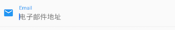
We have successfully customized the underline color and question text style. Careful readers may have discovered that after customization in this way, the input box labelTextwill not be highlighted when it gets the focus , just like the "Username" in the picture above. "It was supposed to be blue, but it is now gray, and we still can’t define the underline width. Another flexible way is to hide TextFieldits own underline directly , and then Containerdefine the style by de-nesting, such as:
Container(
 child: TextField(
   keyboardType: TextInputType.emailAddress,
   decoration: InputDecoration(
       labelText: "Email",
       hintText: "电子邮件地址",
       prefixIcon: Icon(Icons.email),
       border: InputBorder.none //隐藏下划线
   )
 ),
 decoration: BoxDecoration(
     // 下滑线浅灰色,宽度1像素
     border: Border(bottom: BorderSide(color: Colors.grey[200], width: 1.0))
 ),
)
running result:
Through this combination of components, you can also define background rounded corners. Generally speaking, decorationcustomize the style first, if decorationit can’t be achieved, then use the widget combination method.
Question: In this example, the color of the underline is fixed, so the color is still gray after the focus is obtained. How to realize that the underline also changes color after clicking?
In actual business, before the data is formally submitted to the server, the validity of each input box data will be verified, but it TextFieldwill be very troublesome to verify each one separately. Also, if the user wants to clear a group TextFieldof contents, is there any better way besides clearing them one by one? To this end, Flutter provides a Formcomponent that can group input boxes, and then perform some unified operations, such as input content verification, input box reset, and input content preservation.
FormInherited from the StatefulWidgetobject, its corresponding state class is FormState. Let's first look at Formthe definition of the class:
Form({
 @required Widget child,
 bool autovalidate = false,
 WillPopCallback onWillPop,
 VoidCallback onChanged,
})
autovalidate: Whether to automatically check the input content; when istruethe time, each sub FormField content will automatically check the legality of changes, and directly displays an error message. Otherwise, it needsFormState.validate()to be manually verified by calling .onWillPop: DetermineFormwhether the route you are in can return directly (such as clicking the return button). The callback returns anFutureobject. If the final result of the Future isfalse, the current route will not return; if it istrue, it will return to the previous route. This attribute is usually used to intercept the return button.onChanged: This callback is triggered whenFormany of the sub-FormFieldcontent changes.
FormThe descendant elements of must be a FormFieldtype, FormFieldan abstract class, define several attributes, FormStateinternally use them to complete the operation, FormFieldpart of the definition is as follows:
const FormField({
 ...
 FormFieldSetter<T> onSaved, //保存回调
 FormFieldValidator<T>  validator, //验证回调
 T initialValue, //初始值
 bool autovalidate = false, //是否自动校验。
})
For ease of use, Flutter provides a TextFormFieldcomponent that inherits from the FormFieldclass and is also TextFielda wrapper class, so in addition to the FormFielddefined properties, it also includes TextFieldproperties.
FormStateFor Formthe Stateclass, you can pass Form.of()or GlobalKeyget. We can use it to perform unified operations on Formour descendants FormField. Let's look at the three commonly used methods:
FormState.validate(): After calling this method, theFormdescendantFormField的validatecallback will be called , if one of the verification fails, it will return false, and all the verification failed items will return the error message returned by the user.FormState.save(): After calling this method, the callback ofFormdescendants will be called to save the form contentFormField``saveFormState.reset(): After calling this method,FormFieldthe content of descendants will be cleared.
Let's modify the user login example above and verify before submitting:
- The user name cannot be empty. If it is empty, it will prompt "User name cannot be empty".
- The password cannot be less than 6 digits. If it is less than 6, it will prompt "The password cannot be less than 6 digits".
Complete code:
class FormTestRoute extends StatefulWidget {
 @override
 _FormTestRouteState createState() => new _FormTestRouteState();
}

class _FormTestRouteState extends State<FormTestRoute> {
 TextEditingController _unameController = new TextEditingController();
 TextEditingController _pwdController = new TextEditingController();
 GlobalKey _formKey= new GlobalKey<FormState>();

 @override
 Widget build(BuildContext context) {
   return Scaffold(
     appBar: AppBar(
       title:Text("Form Test"),
     ),
     body: Padding(
       padding: const EdgeInsets.symmetric(vertical: 16.0, horizontal: 24.0),
       child: Form(
         key: _formKey, //设置globalKey,用于后面获取FormState
         autovalidate: true, //开启自动校验
         child: Column(
           children: <Widget>[
             TextFormField(
                 autofocus: true,
                 controller: _unameController,
                 decoration: InputDecoration(
                     labelText: "用户名",
                     hintText: "用户名或邮箱",
                     icon: Icon(Icons.person)
                 ),
                 // 校验用户名
                 validator: (v) {
                   return v
                       .trim()
                       .length > 0 ? null : "用户名不能为空";
                 }

             ),
             TextFormField(
                 controller: _pwdController,
                 decoration: InputDecoration(
                     labelText: "密码",
                     hintText: "您的登录密码",
                     icon: Icon(Icons.lock)
                 ),
                 obscureText: true,
                 //校验密码
                 validator: (v) {
                   return v
                       .trim()
                       .length > 5 ? null : "密码不能少于6位";
                 }
             ),
             // 登录按钮
             Padding(
               padding: const EdgeInsets.only(top: 28.0),
               child: Row(
                 children: <Widget>[
                   Expanded(
                     child: RaisedButton(
                       padding: EdgeInsets.all(15.0),
                       child: Text("登录"),
                       color: Theme
                           .of(context)
                           .primaryColor,
                       textColor: Colors.white,
                       onPressed: () {
                         //在这里不能通过此方式获取FormState,context不对
                         //print(Form.of(context));

                         // 通过_formKey.currentState 获取FormState后,
                         // 调用validate()方法校验用户名密码是否合法,校验
                         // 通过后再提交数据。
                         if((_formKey.currentState as FormState).validate()){
                           //验证通过提交数据
                         }
                       },
                     ),
                   ),
                 ],
               ),
             )
           ],
         ),
       ),
     ),
   );
 }
}
The effect after running is shown in Figure 3-29:

Note that the login button onPressedmethod can not Form.of(context)be obtained, because, here contextis FormTestRoutethe context, which Form.of(context)is based on the specified contextto find the root, while FormStatein FormTestRoutesub-tree, it will not do. The correct approach is through Builderto build the login button Builderwill widgetnode contextas a callback parameter:
Expanded(
// 通过Builder来获取RaisedButton所在widget树的真正context(Element)
 child:Builder(builder: (context){
   return RaisedButton(
     ...
     onPressed: () {
       //由于本widget也是Form的子代widget,所以可以通过下面方式获取FormState
       if(Form.of(context).validate()){
         //验证通过提交数据
       }
     },
   );
 })
)
In fact, contextit is Elementan interface corresponding to the operation of Widget . Since the corresponding Widget tree Elementis different, they contextare all different context. More content will be discussed in detail in the advanced section later. There are many "of(context)" methods in Flutter, and readers must pay attention to contextwhether they are correct when using them .