RFC: UI Layout Changes (Part 1) #398
Replies: 3 comments 14 replies
-
|
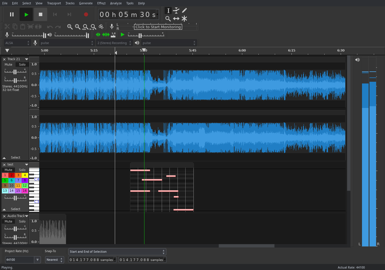
I love this! The transport looks way more usable. I've been writing a feature request https://github.com/tenacityteam/tenacity/issues/399 today for changes to the meters as well. There I propose docking areas on both sides of the window to make vertical meters useful. I've also been thinking about ways to improve the device/channel ui, It's a bit confusing right now imo. It might be a good idea to indicate which is protocol/driver, and which is device. And the channel-count label "recording channels" could easily be interpreted not as number of channels to record, but channel routing, and it's also strange to me to have the label included in the drop down of the first two options. |
Beta Was this translation helpful? Give feedback.
This comment was marked as off-topic.
This comment was marked as off-topic.
This comment was marked as off-topic.
This comment was marked as off-topic.
This comment was marked as off-topic.
This comment was marked as off-topic.
This comment was marked as off-topic.
This comment was marked as off-topic.
This comment was marked as off-topic.
This comment was marked as off-topic.
-
|
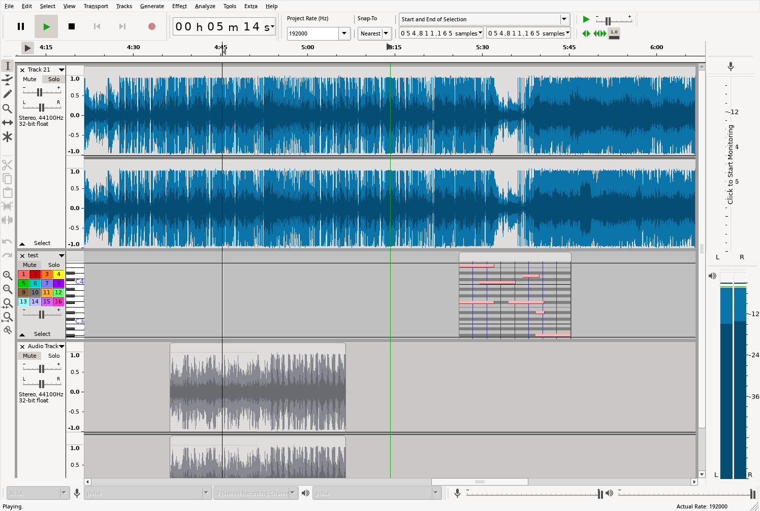
I've been looking into the toolbar dock code a bit, and begun experimenting with adding vertical docks. |
Beta Was this translation helpful? Give feedback.
-
|
This improvement is worth pursuing. The pre-fork UI feels like it was made for 4:3 Aspect Ratio Screens. Vertical Toolbars like this will enable customized UI layouts that use the space on today's 16:9 (and wider) screens much better. |
Beta Was this translation helpful? Give feedback.
-
|
Cool, I'll keep working on it! There are quite som things to figure out still though manly concerning sizing. Currently working on alternative layouts for toolbars docked on vertical toolbars, which makes it possible to place the long edit toolbars on the side as well, and makes the toolbar handles appear horizontally. Yeah good point. Also I'm way too used to reading vertical meters from using analog mixers quite a bit. |
Beta Was this translation helpful? Give feedback.
-
|
I am starting to think that moving the volume/microphone volume bars from the top bar to the bottom bar and moving the microphone bar like in the latter screenshot may be a better, less ground-shifting and more ergonomic idea. Not sure. |
Beta Was this translation helpful? Give feedback.
-
|
Some more updates on my experiments:
To do:
I will try to have a PR up for testing in the near future. Just have to go through some key points of my to-do list, and split up changes into appropriate commits. So far the classic layout is still possible, it's just a matter of how you choose to position the docks. |
Beta Was this translation helpful? Give feedback.
-
|
Another thing I just realized is that it should be possible to write a custom drop down control instead of relying on system ones, much alike NumericTextCtrl, but that's it's own project I guess. |
Beta Was this translation helpful? Give feedback.
-
|
I (and others that I asked on Mastodon) seem to have a concern regarding the positioning of the tools. I think it makes things harder to reach, rather then easier. I am also not sure whether the sample rate, which is an option that nobody really touches, should be that close to the 5 buttons. I agree with keeping the Snap-To and the options revolving around selecting the samples together. We also probably have to do something about the Undo/Redo buttons. |
Beta Was this translation helpful? Give feedback.
-
|
I have to clarify that this isn't in any way a final layout or a proposal of a layout, rather a screenshot of what's possible with vertical dockers in my current wip build. Since you can move everything around the layout is up to the user. What's a good default layout is however a discussion to be had. I really prefer the the tools on the side, and vertical dockers gives that option. No one has to actually position them that way. I just like the extra flexibility of having that option. I always felt the huge number of top toolbars makes the interface both confusing and ugly. For me having the tools on the side makes the tools way easier to find and select, but maybe that's just me. Yeah I really agree that the project sample rate should ideally not even be a toolbar. perhaps there should be a project settings section in the prefs window? I haven't started breaking apart toolbars yet. I agree with breaking undo/redo and zoom controls into separate toolbars. but it's on the to do list. As for the snapping/selection toolbar that's it's own mess. |
Beta Was this translation helpful? Give feedback.
-
|
I'm trying to make all the changes as compatible as possible with the goal of eventually having a new default layout, but also an easy way of loading the classic layout as a preset. |
Beta Was this translation helpful? Give feedback.
Uh oh!
There was an error while loading. Please reload this page.
Uh oh!
There was an error while loading. Please reload this page.
-
Hi, I spent some time today experimenting with the UI and I explored a couple of different ideas.
The primary idea here is to move the volume indicators on a new bar, while taking advantage of the vast amount of space that's available to us. This obviously isn't final, just a general idea, but it will definitely need a lot of polishing if I were to actually implement something like this (since I only really moved widgets around). I'm sort of skeptical about the concept of sacrificing horizontal screen space in order to make the volume bars more easily readable. I'd like to hear your feedback.
Some ideas haven't been included in the screenshot, as the screenshot depict an actual instance of Tenacity running on top of the master branch (a21a554). They are out of scope for the time being, until I (or someone else) come up with some tangible examples. Some of them include
Beta Was this translation helpful? Give feedback.
All reactions