
Grial offers a set of beautiful XAML UI views made for Xamarin Forms. These cover the most typical Mobile UI patterns and are crafted with developers in mind.
Grial is based on the MVVM pattern ensuring a clear separation between the UI and the viewmodels through data bindings. Also, Grial is framework agnostic so you can choose any MVVM framework you feel comfortable with.
We provide an easy way to focus on the business logic and almost forget about the UI by providing:
- ready-made views
- templates
- bindings
- models and viewmodels
- and styling through a customizable theme
Grial is based on Artina, our library of custom renderers and UI controls for Xamarin Forms.
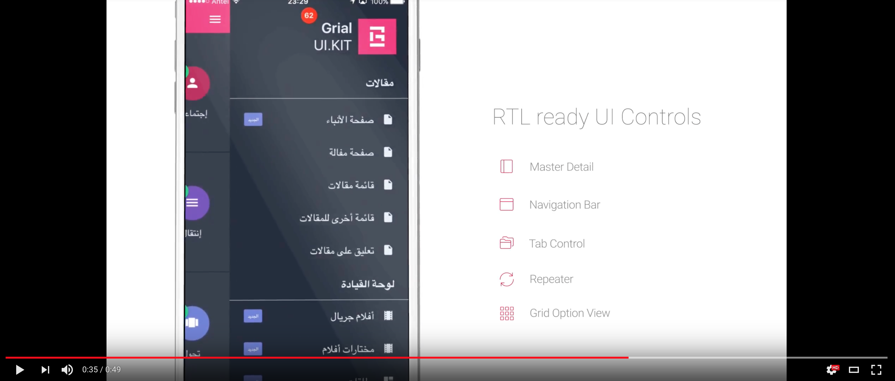
Get all our 70+ pages and templates RTL enabled!
Check more details about [Grial RTL](rtl-page.html).
Please visit Grial support website.
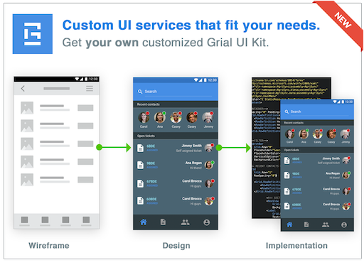
We also provide design and Grial customization services.
- Moved to .Net Standard from old PCLs.
- Bindings enabled for TabItem properties.
- Custom renderers
- Added
BorderStyleandPlaceholderpropertiesEditors. - Added
FieldBackgroundColor,SearchIconColor,BorderWidthandBorderColorforSearchBar.
- Added
- Localization support through regular RESX files consumables from Xaml through our extensions, see i18n.
- Support for Right-to-left layouts in every page and template, see Grial RTL.
- WrapPanel layout that allow elements to flow in an HTML-like fashion (used in
MovieSelectionPage.xaml). - Circle buttons.
- Easier project setup
- Grial online admin allows to download your customized Grial Sample using your own namespaces and assembly names, saving lot of time with setup
- Grial Starter
- Bare minimum Grial project with your namespaces and assemblies
- Responsive features
- Added Responsive helpers
- Take full control of how things layout on pages, different devices, orientations and platforms
- Tablet optimized experience
- Responsive Android and iOS Splash pages
- Added Responsive helpers
- New themes
- 3 new themes
- Added support for merged dictionaries
- Added build task to ease colors compilation
- Icons
- New icons
- New default base font (grialshapes)
- Fontawesome 4.7 and Ionicicons 2.0.0 fonts
- Font helpers for easier icons referencing in your code
- Easier icons setup through font helpers
- New icons
- Improved documentation
- New UI Controls
- RoundedLabel
- artina Repeater
- artina TabControl (available on Grial Pro)
- Lottie animations support
- Better and more efficient images support through FFImageLoading
- More screens
Full Grial release notes are here.
Grial UIKit supports:
- Android 4.2+ (API Level 17) through AppCompatV7.
- iOS 9.0+
- Xamarin Forms:
- Grial 2.5 was released with Xamarin Forms
2.4.0.282version. - We will keep the product updated to latest stable versions.
- Artina packages require
2.3.1.144+.
- Grial 2.5 was released with Xamarin Forms
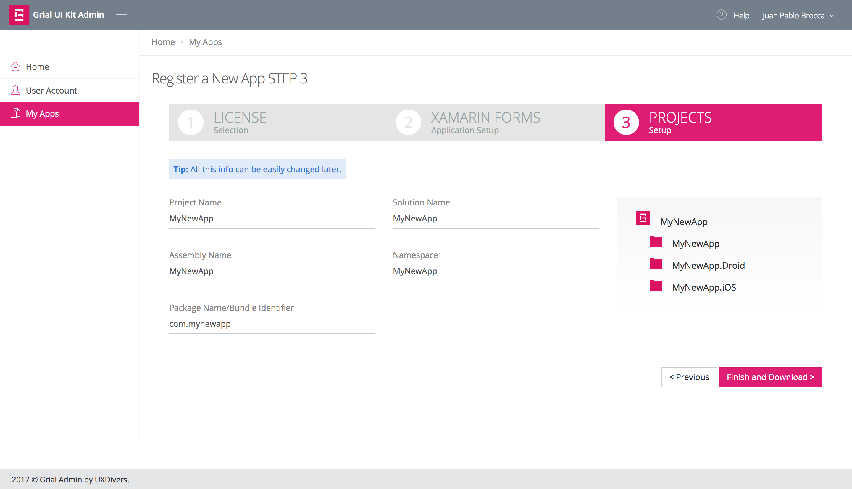
Right after purchasing Grial you receive an email with a link to Grial Admin where you can:
- Register your user and claim your license
- Administrate your licenses
- Customize and download Grial
Grial license is App-based. Once you create an Application associated to a Grial license in Grial Admin you can configure settings like project name, namespaces, iOS bundle id, android package name, cultures, etc.
Once you have finished the customization you can download a zip with two Visual Studio solutions:
|_ <YourAppName.zip>
	|_ full
	|_ starter
- Full Grial solution
- A copy of Grial sample app (70+ screens and templates) customized with your app name, assembly name, etc.
- Grial Starter solution
- Bare-minimum Grial-ready solution to start coding your project where you can incrementally include pages and templates from Grial.
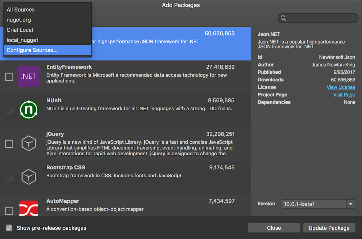
Once you download Grial, there's just one more step to follow before you can compiling. Grial uses packages hosted in our private nuget package source. You need to configure that nuget source in your IDE of choice.
- In Visual Studio go to
Tools > Options > Nuget Package Manager > Package Sources
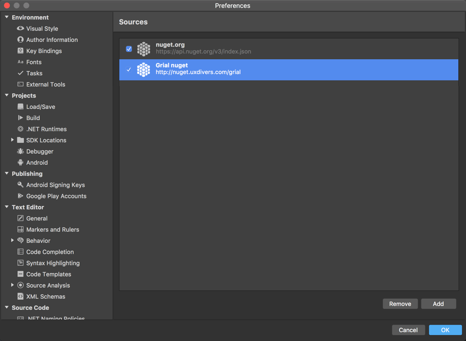
- In Visual Studio for Mac / Xamarin Studio go to:
Preferences > Nuget > Sources
IMPORTANT
You will need to use this URL as location:
http://nuget.uxdivers.com/grial
You will also need your user and password for Grial Admin to authenticate.
For more information please check [Nuget Access Setup on Grial Admin](#nuget-access-setup) section.

Very Important
Once the Grial nuget source is configured you will need to restore the solution packages.
You can use your own credentials to access the private Nuget source. Additionally, you can configure a dedicated nuget user to authenticate against the nuget server. This is the way to go if you need to share the credentials with your team or use them in your CI build.
To setup the Nuget credentials go to Grial Admin:
User Account > Profile > Nuget Access
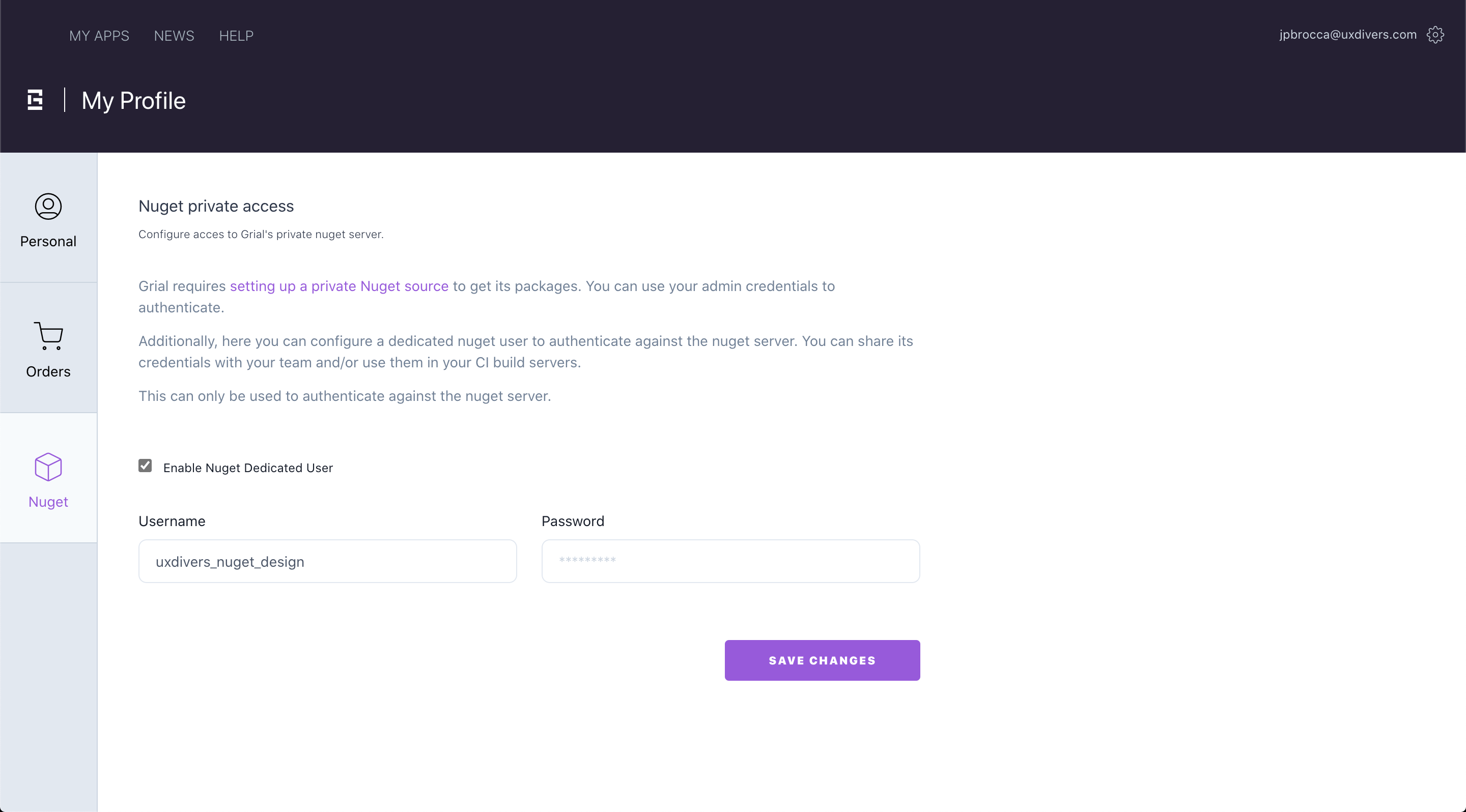
** NOTE:** This credential can only be used to authenticate against the nuget server.
Grial requires a license file in order to execute. Once you purchase the product you will be redirected to the Grial Admin website where you can register your app and download its license.
- The license is a file (named
GrialLicenseby default), that must be added at the root of your platform specific projects (iOS and Android). - The file must have Build Action
Embedded Resource. - The kit must be initialized by calling method
UXDivers.Artina.Shared.GrialKit.Init()before using any Grial component, passing the name of the embedded resource that contains the license. Otherwise it will fail.
In Xamarin Forms, an embedded resource name is formed by the following scheme:
<Default Namespace of the Container Project>.<Name of the File>.
So, assumming the default namespace of your Android Project is MyApp.Droid and the license file is called GrialLicense
you will call Init
passing the name MyApp.Droid.GrialLicense
iOS is analogus, but taking the default namespace of the iOS project.
Android
namespace MyApp.Droid.Droid
{
	...
	public class MainActivity : FormsAppCompatActivity
	{
		protected override void OnCreate(Bundle bundle)
		{
            ...
            GrialKit.Init(this, "MyApp.Droid.GrialLicense");
            ...
iOS
namespace MyApp.iOS.iOS
{
	public class AppDelegate : FormsApplicationDelegate
	{
		public override bool FinishedLaunching (UIApplication app, NSDictionary options)
		{
			...
			GrialKit.Init(new ThemeColors(), "MyApp.iOS.GrialLicense");
			...
The Init method will verify that:
- Android your app name and package name match those defined in the license.
- iOS your app name and boundle identifier match those defined in the license.
Important: if your Application is localized the license check also verifies the localized names you define in Grial Admin, see localization section.
If any of those does not match, the license verfication will fail saying which one. See License Verification for a detailed explanation.
The starter and full projects that can be downloaded from the Grial Admin website comes with the license in place and pre-configured.
The licenses you download from Grial Admin website have two modes:
-
Development Mode (default)
- This is ment while things are being developed and may change.
- Expires 30 days after the generation date. In such case, it displays an error with a link to renew and download a new one.
- Can be renewed anytime to get another 30.
-
Production Mode
- You should switch to this mode once you are ready to publish the app and you are sure about the final name, android package and iOS bundle identifier of your app.
- Production licenses never expire.
- Once in this mode there is no way to change it back to development mode and you will no loger be able to edit your app info in the Grial Admin website.
New registered apps in the Admin portal starts in Development mode, of course.
In Android, the license verification will check that:
- the license's app name matches your app name as defined in the
AndroidManifest.xmlandMainActivity.cs. Note that the name may depend upon the culture if you have a localized app (read more on the localization section). - the license's package name matches your app's package name as defined in the
AndroidManifest.xml.
The following code fragments ilustrates which values should match:
AndroidManifest.xml
<?xml version="1.0" encoding="utf-8"?>
<manifest ... package="ANDROID_PACKAGE_NAME" ...>
    ...
	<application ... android:label="@string/app_name" ...></application>
	...
</manifest>
MainActivity.cs
namespace MyApp.Droid
{
	[Activity(Label = @string/app_name, ...)]
	public class MainActivity : FormsAppCompatActivity
	{
		protected override void OnCreate(Bundle bundle)
	...
Application name is declared through @string/app_name. This is a localized Android string that defines the application name. The actual
value of the string is defined in the Strings.xml resource file:
<?xml version="1.0" encoding="UTF-8" ?>
<resources>
	<string name="app_name">My App Name</string>
</resources>
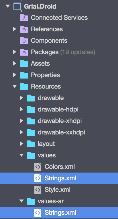
If you define multiple cultures in Grial Admin you will see multiple value-CULTURE folders (in the image above -ar stands for Arabic), each with the specific name you pick.
If the app is not localized, only one Strings file under values folder will exist and will be the one containing the name.
In case the Application is localized, the check will verify that the runtime name matches the one defined in the license for the current culture.
In iOS, the license verification will check that:
- the license's app name matches the name defined in the
Info.plistfile.- If the
CFBundleDisplayNameis defined it will be considered as the application's name. - If it is not defined, the
CFBundleNamewill be used. - Note that the name may depend upon the culture if you have a localized app (read more on the localization section).
- If the
- the license's boundle identifier matches the
CFBundleIdentifierentry in theInfo.plist.
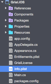
In case you have a localized app defined in Grial Admin, you will see multiple Info.plist alternative files:
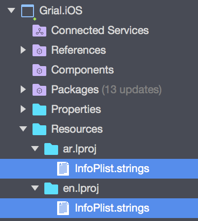
Each file defines CFBundleDisplayName and CFBundleName for the specific culture defined by the folder name. In the image
above en stands for English and ar for Arabic.
In case the Application is localized, the check will verify that the runtime display name (or name when display name is not defined) matches the one defined in the license for the current culture.
This is displayed when there was an error reading the embedded resource passed to the GrialKit.Init.
That tipically means that:
- the license file is not marked as
Embedded Resource - ...or it is not in the root of the platform specific project.
- ...or the embedded resource is not correctly named following the covention:
<Default Namespace of the Container Project>.<Name of the File>above explained.
This message is displayed with any of the following cases:
- "The Bundle Indentifier does not match the license's."
- "The Package Name does not match the license's."
- "Both the appName and the Bundle Identifier/PackageName does not match the license's."
This means the information on the License file does not match the respective param in your solution.
In order to fix this error, follow these steps:
- Double check that the information you entered in the Grial Admin website matches that in your solution.
- See section License Verification for details about what to check.
- Once you are sure the info is correct download the license again and replace the license file you have in your platform specific projects.
- Run you app and verifiy the problem is fixed.
If the problem persists, it might mean that not all components were correctly updated during deployment. This usually happens because in order to make things faster Xamarin deploys only what has changed, but this process some times misses stuff. In order to fix this manually remove the app from the device or simulator you are targetting, then do a rebuild in your solution. Run it again and verfiy the problem is fixed.
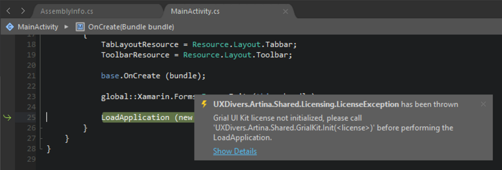
"Grial UI Kit license not initialized, please call 'UXDivers.Artina.Shared.GrialKit.Init()' before performing the LoadApplication." Error Message
This error occurs when you are not calling Init or there is a Grial component being used before invoking Init.
Release APK License Issue: "UXDivers.Artina.Shared.LicenseException: Internal license validation error"
This is probably caused because in Release Mode you have set the linker behavior to Link All assemblies.
Android
Setting the linker to Link all assemblies will start producing the mentioned error.
In order to fix it you need to exclude UXDivers.Artina assemblies from the linking process.
You can do that by setting Ignore assemblies option to:
UXDivers.Artina.Shared.Base;UXDivers.Artina.Shared.Base.Droid;UXDivers.Artina.Shared;UXDivers.Artina.Shared.Droid.
After that the app will stop complaining.
Then it started complaining about stuff that was only referenced from the XAML (since the linker does not consider the XAML while analyzing what should be kept).
Essentially it complains about the GrialLightTheme (which is the theme currently set) and the GrialShapesFont.
In order to fix this, a PreserveAttribute class is needed to be created as suggested
here
and add it to the GrialLightTheme and the GrialShapesFont, as follows:
	[Preserve(AllMembers = true)]
	public partial class GrialLightTheme
	{


	[Preserve(AllMembers = true)]
	public class GrialShapesFont
	{
For your convenience we have structured the PCL project with the following setup:
Grial
	|_ Helpers
	|_ Models
	|_ Properties
	|_ Resx
	|_ Themes
	|_ ViewModels
	|_ Views
For more info please refer to [Grial Internationalization](/i18n-page.html).
## Previewing Grial with Gorilla Player
Gorilla Player is a great tool for immediate previewing and debugging Xaml code.

Grial Admin offers the option to download Grial with Gorilla Player pre-configured.
If you choose the Gorilla Ready options the downloaded VS solution will have a Build Configuration named Gorilla that
you can use to compile and run your project in any device and debug your Xaml with no need to compile a second time.

Follow these steps:
- Dowload and install Gorilla Player: http://gorillaplayer.com/
- Run Gorilla Player
- Run your project under Gorilla Configuration

For more information on Gorilla Player config and setup please check here.
Gorilla also helps to work with Grial localized apps and RTL layouts.
##Theme And Branding Of Your App
Grial offers a simple way to customize the look and feel by providing an easy and extensible theme architecture. It provides several colors and styles that will ease your UI tweaks through platforms and achieving a consistent look and feel for your app.
To start customizing your app's look and feel, please refer to App.xaml file located on the Grial (PCL) folder project:
Grial
	|_ App.xaml
Inside the file you will find basically two main things:
-
Theme colors (through merged dictionaries)
- These are the resources you will be mostly working with
-
Theme styles, measures, images, etc. and other resources
<Application.Resources>
  <ResourceDictionary MergedWith="local:GrialLightTheme">
  	<!--<ResourceDictionary MergedWith="local:GrialDarkTheme">-->
  	<!--<ResourceDictionary MergedWith="local:GrialEnterpriseTheme">-->

  	<!--
  		Use the following file as your theme colors.
  		Simply replace colors to march your brand.
  		(It is based on GrialLightTheme but you can use the colors
  		of any other theme)
  	-->
  	<!--<ResourceDictionary MergedWith="local:MyAppTheme">-->
  	...
  </ResourceDictionary>
</Application.Resources>
A single resource dictionary (local:GrialLightTheme, is the Grial default theme for Grial 2.0) is actually being loaded and merged with the theme "base" resources.
There are 3 available themes you can use for your app:
These can be used as the starting point for your own theme.
An additional theme which is actually a copy of Grial Default theme (Light) is also provided so you can start working on that theme without changing the default ones:
- MyAppTheme (MyAppTheme.xaml)
If you want to change the current theme of your app, simply point the MergedWith attribute and point to any of the available themes (or simply uncomment the ones on App.xaml).
You can find the provided themes on the following location on your Grial PCL project:
Grial
	|_ Themes
		|_ GrialLightTheme.xaml
		|_ GrialDarkTheme.xaml
		|_ GrialEnterpriseTheme.xaml
		|
		|_ MyAppTheme.xaml
The most important color is the AccentColor followed by the BaseTextColor, which are used across the whole theme/app. Basically changing these values will affect the overall look and feel of your App.
The theme is made with a "Top Down" approach, so the deeper you go into the theme styles the more specific tweaks are made.

Important: Due to some limitations on Xamarin Forms it is not possible to style everything right from App.xaml.
That is the reason why when running our sample you can see most of the colors change when you change the current theme at runtime, but not the ListView selected items and some custom renderers.
In Grial 2.0 we have added a new, easier and more reliable mechanism to compile theme colors on iOS and Android projects.
This is made through a Build Task so the process is transparent.
This build task is automatically added to your project when you include UXDivers.Artina.Shared nuget packages in your project.
All you need to do is to set the theme on App.xaml through the MergedWith property, then the build task will:
- find the theme and propagate the theme's colors to
Colors.xmlon the Android projectThemeColors.cson the iOS project
That way you will have everything in sync and only need to focus on the theme colors.
Theme synchronization task can be configured using Themes.json file.
This file is just a JSON file that must be created in the same folder as the .csproj that contains the task resides.
The task will read that file looking for settings.
Starting from version (2.0.52.0), the file must be placed in the platform specific projects (not the PCL as previous versions requires).
If you want to configure both Android and iOS you will need to add two Themes.json independent files for each project.
Themes.json may contain one or more of these properties (the values reflect the default value of the property if not specified at all):
	{
		"ThemeSyncEnabled": true,
		"AppXamlFullPath": null,
		"AppXamlProjectFullPath": null,
		"iOSColorsFileName": "ThemeColors.cs",
		"AndroidColorsFile": "Resources\\values\\Colors.xml",
		"iOSColorsNamespace": null,
		"ThemesFolder":"Themes"
	}
-
ThemeSyncEnabled (
boolean).- Default value:
true. - If set to false, theme sync will not happen at all for the projects in the folder.
- Default value:
-
AppXamlFullPath (
string).- Default value:
null. - The full path to the
App.xaml, if specified the task will not try to infer it.
- Default value:
-
AppXamlProjectFullPath (
string).- Default value:
null. - This parameter is only considered if AppXamlFullPath was specified.
- The parameter specifies the full path to the project that contains the
App.xaml. - If only AppXamlFullPath is specified, the task will try to infer AppXamlProjectFullPath.
- If you specify both it will just stick to them.
- Default value:
-
iOSColorsFileName (
string)- Default value:
"ThemeColors.cs". - Name of the
Colorsfile iniOS, just in case someone need to change its name.
- Default value:
-
AndroidColorsFile (
string)- Default value:
"Resources\\values\\Colors.xml". - Path of the
Android.Colors.xaml, just in case the default one is changed.
- Default value:
-
iOSColorsNamespace (
string)- Default value:
null. - Namespace used for the
ThemesColor class. If not specified thedefault root namespaceof the project will be used.
- Default value:
-
ThemesFolder (
string)- Default value:
"Themes". - Specifies the name of the
FolderwhereThemesare stored. - This is just to optimize performance.
- We try to resolve the
Theme XAMLagainst the XAMLs within this folder first. - If we don't find it we will look across the whole project.
- We try to resolve the
- Default value:
One final comment:
- Now by default if the task fails for some reason it will report a Warning, not an Error.
- If you still want to report an Error, simply add a property to your
.csprojcalledGrialFailOnErrorand set it totrue:
<GrialFailOnError>true</GrialFailOnError>
For example:
<Project DefaultTargets="Build" ToolsVersion="4.0" xmlns="http://schemas.microsoft.com/developer/msbuild/2003">
	<PropertyGroup>
		<Configuration Condition=" '$(Configuration)' == '' ">Debug</Configuration>
		<Platform Condition=" '$(Platform)' == '' ">iPhoneSimulator</Platform>
		<ProjectTypeGuids>{FEACFBD2-3405-455C-9665-78FE426C6842};{FAE04EC0-301F-11D3-BF4B-00C04F79EFBC}</ProjectTypeGuids>
		<ProjectGuid>{45DA7B47-C579-4BC1-B1E5-97EEA0C669CD}</ProjectGuid>
		<OutputType>Exe</OutputType>
		<RootNamespace>UXDivers.Artina.Grial</RootNamespace>
		<IPhoneResourcePrefix>Resources</IPhoneResourcePrefix>
		<AssemblyName>UXDiversArtinaGrialiOS</AssemblyName>
		<ReleaseVersion>2.0</ReleaseVersion>

		<GrialFailOnError>true</GrialFailOnError>

	</PropertyGroup>
</Project>
Notices this this flag is project only affects the project where it is specified. You need to set it in the iOS and Android projects if you want to change the behavior in both platforms.
If your App.xaml file is not found, neither any xaml file whose root node is <Application> you will see the following warning on your build output:
“Can’t find App.xaml file in <your_project>. Aborting.”
In order to instruct the build task the right path to your App.xaml or equivalent file, you will need to:
- Add a json file named "Themes.json" to the root of the platform specific projects.
- There is no need to include the file in the project, it just must exists in the file system for the task to pick it up.
- Add the following:
	{
		"AppXamlFullPath" : "<absolute path of App.xaml in your project>"
	}
Optionally you can add another property called AppXamlProjectFullPath containing the path to the project that contains the App.xaml. If not specified, the task will try to infer it.
We also provide an easy way to replace your app's logo by modifying an specific resource on ThemeDictionary, called "BrandImage". Simply locate the resource and point it to your image file.
Additionally we provided an specific XAML view to help your branding needs, the "BrandBlock.xaml", which can be found on the following location:
		 Grial
	|_ Views
		|_ Common
			|_ BrandBlock.xaml
Grial uses a common practice in design which is using icons through a font.
As icons are contained on a font it is really easy to use all the styling properties available to render a text control (<Label>):
- TextColor
- BackgroundColor
- FontSize
Since they are made from vectors they will render properly across different devices with different pixel densities. In other words, they will look sharp wherever you display them.
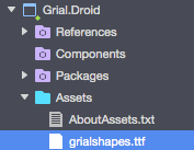
Grial uses its own font: GrialShapes.ttf provided with Grial Sample.
All its icons are used on our sample and were made with Material Design Look and Feel.
The font acts as the source for basic shapes used on Grial's templates (circles, squares, etc.).
This way adding your font with your own icons should not create conflicts with Grial.
We have made easy to setup the fonts whitin the application theme (App.xaml):
	<!-- BASE STYLES -->
	<Style x:Key="FontIcon" TargetType="Label">
		<Setter Property="FontFamily" Value="{ StaticResource IconsFontFamily }" />
	</Style>

	<Style x:Key="FontIconBase" TargetType="Label">
		<Setter Property="FontFamily" Value="{ StaticResource GrialShapesFontFamily }" />
	</Style>
In the above code you can see that both styles are pointing actually to grialshapes.ttf file through two static resources:
GrialShapesFontFamilyIconsFontFamily
	<OnPlatform
		x:Key="GrialShapesFontFamily" x:TypeArguments="x:String"
		Android="grialshapes.ttf#grialshapes"
		iOS="grialshapes"
	/>

	<!-- PUT YOUR OWN ICONS FONT FAMILY BELOW -->
	<OnPlatform
		x:Key="IconsFontFamily" x:TypeArguments="x:String"
		Android="grialshapes.ttf#grialshapes"
		iOS="grialshapes"
	/>
Let's take a look at the default Grial rendering for font icons:
The DashboardItemTemplate.xaml uses the default icons in this way:
...then, the final rendered result is as it follows:
Now, suppose you need to change the icons to achieve this requirement:
...so the rendered DashboardItemTemplate.xaml will look as follows:

To make this happen just make the IconsFontFamily resource value on App.xaml, to point to your font file name (for instance MyCustomIconsFont.ttf)
then you will get all the basic shapes applied (for instance on badges, dashboard templates, etc.),
but you will be able to change the other icons displayed on your App:
	<!-- PUT YOUR OWN ICONS FONT FAMILY BELOW -->
	<OnPlatform
		x:Key="IconsFontFamily" x:TypeArguments="x:String"
		Android="MyCustomFontIcon.ttf#MyCustomFontIcon"
		iOS="MyCustomFontIcon"
	/>
NOTE: Grial comes with fontawesome 4.7 and ionicons 2.0.0 fonts added to the projects (iOS and Android) and also its helper classes to easily get the icons' characters:
 Grial
	|_ Helpers
	   |_ FontawesomeFont.cs
	   |_ GrialShapesFont.cs
	   |_ IoniciconsFont.cs
Referencing icons will be easier this way. If you don't have the chance to produce the helper file with all the characters mappings for your icons keep in mind the following:
- Copy the unicode value of your icon (something like f00d)
- If you are using the icon on a .XAML file, you should use it as "&#x" + UNICODE + ";"
- If you are using the icon on a .CS file, you should use it as "\u" + UNICODE
For more info check referencing icons on code behind and XAML.
There are several web sites which can help you to create your own icon font:
We recommend including your icons and add them to your project following previous steps.
Important: Icons can ONLY be used on <Label> controls.
Xamarin Forms allows to customize only some properties of its UI controls. Usually a professional UI requires further customization. This can be achieved through Custom Renderers.
Artina provides a set of Custom Renderers and attached properties to improve the styling capabilities of Xamarin Forms' UI controls.
For example, the Artina attached properties for an <Entry> control:
<Entry
	...
	artina:EntryProperties.BorderStyle="BottomLine"
	artina:EntryProperties.BorderWidth="1"
	... />
- Artina attached properties:
BorderStyle- Allows to customize how the border should look like.
- Possible values are:
None- Forces no border to be shown at all.
BottomLine- Renders a single line at the bottom of the entry.
Rect- Rect draws a rectangle around the Entry.
RoundRect- Renders a rectangle with rounded corners.
Default- Default value.
BorderWidth- The width in pixels fo the border
BorderCornerRadius- The corner radiu in pixels
BorderColor- The color to be used for rendering the border
Besides of specifing the attached properties, we must instruct Xamarin Forms to use the appropiate Custom Renderer (in this case ArtinaEntryRenderer) which is the one that knows how these properties should be renderer.
Custom Renderers in Grial are declared in the AssemblyInfo file of the Grial.iOS and Grial.Droid projects.
If you want to use the attached properties in a different project you need to know that:
- Attached properties
- Defined on the assembly UXDivers.Artina.Shared., therefore you must reference it from your Xamarin Forms project (PCL).
- Custom Renderers
- Defined in UXDivers.Artina.Shared.Droid for Android
- On Android you need to reference both UXDivers.Artina.Shared. and UXDivers.Artina.Shared.Droid.
- Defined on UXDivers.Artina.Shared.iOS for iOS.
- On your iOS project you will need to reference both UXDivers.Artina.Shared. and UXDivers.Artina.Shared.iOS.
- Defined in UXDivers.Artina.Shared.Droid for Android
For more info check Setting Up Artina Custom Renderers in your project ##Splash Screen
Grial provides the needed infrastructure for your app to display your app's splash image.
On Android: Android splashes are responsive, which means they adapt to the size and orientation of your device.
This is made through the theme, a drawable called "splash_drawable.xml" and its background image called splash.png.
Since the splash is styled through the theme it is easy to setup the background color. By default it uses the "ComplementColor" but you can change it to any color by editing "splash_drawable.xml".
Most of the cases you will only replace all the "splash.png" images files with yours.
Grial
	|_ Grial.Droid
		|_ resources
			|_ drawable
				|_ splash.png
				|_ splash_drawable.xml
			|_ drawable-hdpi
				|_ splash.png
			|_ drawable-xhdpi
				|_ splash.png
			|_ drawable-xxhdpi
				|_ splash.png
Starting from Grial 2.5 we added a new availabe color on XAML themes:
<Color x:Key="SplashBackgroundColor">#525ABB</Color>
This color will be used on your Android splash as the background color and will be synced through the themes build task, so everytime you change it on your xaml theme it will be updated on your Android theme too.
On iOS:
Starting from Grial 2.0 the iOS splashes are responsive, which means they adapt to the size and orientation of your device.
We also use the new Unified Storyboards available from iOS 9+. This eases the process since less images are required than before.
Basically there is a single storyboard used across all different devices (phones and tablets).
It contains a centered image (splash.png) which is horizontally and vertically centered.
Most of the cases you will only replace all the "splash.png" images files with yours.
It is also possible to change the background color of the view which contains the image.
Grial
	|_ Grial.iOS
		|_ Splash.storyboard
		|_ Resources
			|_ splash.png
			|_ [email protected]
			|_ splash3x.png
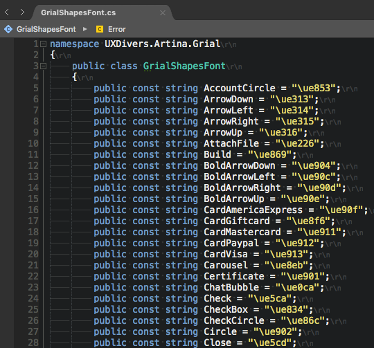
Starting from Grial 2.0 we provide a font helpers per font with all the keys of each icon and its character, making it much easier to work with font icons.
Grial
    |_ Helpers
        |_ GrialShapesFont.cs
        |_ FontasomeFont.cs
        |_ IoniciconsFont.cs
Each font helper has all icons definitions inside:
In order to ease the process, Grial provides a page to preview all the icons bundled with
the grialshapes font by default, but you can pick any of the available.
You can preview this page on the following location on Grial sample:
Grial Theme > Grial Font Icons
If you are on code behind you will need to call the right font helper and the selected icon like this:
GrialShapesFont.Star
On XAML you will need to use it this way:
    <Label
        Style="{ StaticResource FontIcon }"
        Text="{ x:Static local:GrialShapesFont.Star }" />
Note: Rememeber to add the right namespace and assembly names for the xmlns:local:
You will also need to make sure the namespaces are the right ones.
For more info check Adding pages and templates to your project.
xmlns:local="clr-namespace:YOUR_NAMESPACE_HERE;assembly=YOUR_ASSEMBLY_HERE">
Grial 2.0 adds support for responsive design. This is a powerful addition made over Xamarin Forms. Now it is possible to have full control on how things layout on pages and how they react to orientation changes.

The available properties listed by specificity are:
-
Default- This applies to ALL cases by default.
-
Portrait- Applies only when the device (cellphone, tablet or desktop) is in portrait orientation.
-
Landscape- Applies only when the device (cellphone, tablet or desktop) is in landscape orientation.
-
PortraitPhone- Applies only when the device is a phone and is in portrait orientation.
-
PortraitTablet- Applies only when the device is a tablet and is in portrait orientation.
-
PortraitDesktop- Applies only when the device is a desktop and is in portrait orientation.
-
LandscapePhone- Applies only when the device is a phone and is in landscape orientation.
-
LandscapeTablet- Applies only when the device is a tablet and is in landscape orientation.
-
LandscapeDesktop- Applies only when the device is a desktop and is in landscape orientation.
All can be used in conjunction with the following types:
Int|Color|String|Bool
Usage:
<VisualElement Property="{ artina:OnOrientation|type responsiveCase=value }" />
It is possible to control how things display on a tablet landscape and how the should flow on a phone.
Things can go deeper in customization adding more specificity to your declarations:
<Label
    Text="{
        artina:OnOrientationString
            Portrait=IsPortrait,
            Landscape=IsLandscape
        }"
    TextColor="{
        artina:OnOrientationColor
            Default=Red,
            PortraitDesktop=Green
        }"
    Rotation="{
        artina:OnOrientationInt
            Default=0,
            Landscape=90
        }"
    IsVisible="{
        artina:OnOrientationBool
            Default=true,
            PortraitDesktop=false
        }"
/>
For more examples please check:
   Grial
    |_ Views
        |_ ResponsiveHelpersPage.xaml
The fastest way to jump on Grial and start building your app is to use our starter project that you can download from the Grial Admin website. The admin website don't just allow you to download a starter project but allows you to customize it with your namespaces, project names, etc. See section Using Grial Starter and Full for more details.
If you are planning to add Grial to an existing Xamarin Froms project you will need to carry on a serie of steps to get your project ready before start adding Grial screens. Please see Setting Up Grial on an Existing Project for a detailed explanation.
Grial 2.0 provides two solutions available for downloading through Grial Admin:
-
Grial Starter
- This is a solution with all the needed files and dependencies to run Grial.
- It is intended to be used as a starting point where you add the different XAML pages provided with Grial and you start building your app.
-
Grial Full
- This is the full sample
- All the available pages from Grial are included here.
One cool feature introduced in Grial 2.0 is the App setup, where you can customize your copy of Grial with your App namespaces, assembly name, etc.
That way when you finally download your Grial copy, you get everything configured as in your app, for both solutions (Grial Starter and Full), making it easy to copy and paste pages from Grial Full to your existing project.
To make easier adding Grial to an existing project please check setting up Grial on an existing project page.
Typically Grial makes use of:
UXDivers.Artina.Shared.dll- Contains Controls and Custom Renderers
- Pages, views and templates (XAML files)
- Grial theme
App.xaml- Contais colors, main styles and resources shared across all the platforms
- Platform specific styles and resources
- Navigation service
- This is used across Grial sample to manage the Navigation
- You can replace it with your own navigation mechanism.
- Image resources
- These are the images used across all the project using Grial
- Each platform needs its own images with their standard name and location
Grial requires a license file in order to execute. Once you purchase the product you will be redirected to the Grial Admin website where you can register your app and download its license.
- The license is a file (named
GrialLicenseby default), that must be added at the root of your platform specific projects (iOS and Android). - The file must have Build Action
Embedded Resource. - The kit must be initialized by calling method
UXDivers.Artina.Shared.GrialKit.Init()before using any Grial component, passing the name of the embedded resource that contains the license. Otherwise it will fail.
In Xamarin Forms, an embedded resource name is formed by the following scheme:
<Default Namespace of the Container Project>.<Name of the File>.
So, assumming the default namespace of your Android Project is MyApp.Droid and the license file is called GrialLicense
you will call Init
passing the name MyApp.Droid.GrialLicense
iOS is analogus, but taking the default namespace of the iOS project.
Android
namespace MyApp.Droid.Droid
{
	...
	public class MainActivity : FormsAppCompatActivity
	{
		protected override void OnCreate(Bundle bundle)
		{
            ...
            GrialKit.Init(this, "MyApp.Droid.GrialLicense");
            ...
iOS
namespace MyApp.iOS.iOS
{
	public class AppDelegate : FormsApplicationDelegate
	{
		public override bool FinishedLaunching (UIApplication app, NSDictionary options)
		{
			...
			GrialKit.Init(new ThemeColors(), "MyApp.iOS.GrialLicense");
			...
The Init method will verify that:
- Android your app name and package name match those defined in the license.
- iOS your app name and boundle identifier match those defined in the license.
Important: if your Application is localized the license check also verifies the localized names you define in Grial Admin, see localization section.
If any of those does not match, the license verfication will fail saying which one. See License Verification for a detailed explanation.
The starter and full projects that can be downloaded from the Grial Admin website comes with the license in place and pre-configured.
The licenses you download from Grial Admin website have two modes:
-
Development Mode (default)
- This is ment while things are being developed and may change.
- Expires 30 days after the generation date. In such case, it displays an error with a link to renew and download a new one.
- Can be renewed anytime to get another 30.
-
Production Mode
- You should switch to this mode once you are ready to publish the app and you are sure about the final name, android package and iOS bundle identifier of your app.
- Production licenses never expire.
- Once in this mode there is no way to change it back to development mode and you will no loger be able to edit your app info in the Grial Admin website.
New registered apps in the Admin portal starts in Development mode, of course.
In Android, the license verification will check that:
- the license's app name matches your app name as defined in the
AndroidManifest.xmlandMainActivity.cs. Note that the name may depend upon the culture if you have a localized app (read more on the localization section). - the license's package name matches your app's package name as defined in the
AndroidManifest.xml.
The following code fragments ilustrates which values should match:
AndroidManifest.xml
<?xml version="1.0" encoding="utf-8"?>
<manifest ... package="ANDROID_PACKAGE_NAME" ...>
    ...
	<application ... android:label="@string/app_name" ...></application>
	...
</manifest>
MainActivity.cs
namespace MyApp.Droid
{
	[Activity(Label = @string/app_name, ...)]
	public class MainActivity : FormsAppCompatActivity
	{
		protected override void OnCreate(Bundle bundle)
	...
Application name is declared through @string/app_name. This is a localized Android string that defines the application name. The actual
value of the string is defined in the Strings.xml resource file:
<?xml version="1.0" encoding="UTF-8" ?>
<resources>
	<string name="app_name">My App Name</string>
</resources>
If you define multiple cultures in Grial Admin you will see multiple value-CULTURE folders (in the image above -ar stands for Arabic), each with the specific name you pick.
If the app is not localized, only one Strings file under values folder will exist and will be the one containing the name.
In case the Application is localized, the check will verify that the runtime name matches the one defined in the license for the current culture.
In iOS, the license verification will check that:
- the license's app name matches the name defined in the
Info.plistfile.- If the
CFBundleDisplayNameis defined it will be considered as the application's name. - If it is not defined, the
CFBundleNamewill be used. - Note that the name may depend upon the culture if you have a localized app (read more on the localization section).
- If the
- the license's boundle identifier matches the
CFBundleIdentifierentry in theInfo.plist.
In case you have a localized app defined in Grial Admin, you will see multiple Info.plist alternative files:
Each file defines CFBundleDisplayName and CFBundleName for the specific culture defined by the folder name. In the image
above en stands for English and ar for Arabic.
In case the Application is localized, the check will verify that the runtime display name (or name when display name is not defined) matches the one defined in the license for the current culture.
This is displayed when there was an error reading the embedded resource passed to the GrialKit.Init.
That tipically means that:
- the license file is not marked as
Embedded Resource - ...or it is not in the root of the platform specific project.
- ...or the embedded resource is not correctly named following the covention:
<Default Namespace of the Container Project>.<Name of the File>above explained.
This message is displayed with any of the following cases:
- "The Bundle Indentifier does not match the license's."
- "The Package Name does not match the license's."
- "Both the appName and the Bundle Identifier/PackageName does not match the license's."
This means the information on the License file does not match the respective param in your solution.
In order to fix this error, follow these steps:
- Double check that the information you entered in the Grial Admin website matches that in your solution.
- See section License Verification for details about what to check.
- Once you are sure the info is correct download the license again and replace the license file you have in your platform specific projects.
- Run you app and verifiy the problem is fixed.
If the problem persists, it might mean that not all components were correctly updated during deployment. This usually happens because in order to make things faster Xamarin deploys only what has changed, but this process some times misses stuff. In order to fix this manually remove the app from the device or simulator you are targetting, then do a rebuild in your solution. Run it again and verfiy the problem is fixed.
"Grial UI Kit license not initialized, please call 'UXDivers.Artina.Shared.GrialKit.Init()' before performing the LoadApplication." Error Message
This error occurs when you are not calling Init or there is a Grial component being used before invoking Init.
Release APK License Issue: "UXDivers.Artina.Shared.LicenseException: Internal license validation error"
This is probably caused because in Release Mode you have set the linker behavior to Link All assemblies.
Android
Setting the linker to Link all assemblies will start producing the mentioned error.
In order to fix it you need to exclude UXDivers.Artina assemblies from the linking process.
You can do that by setting Ignore assemblies option to:
UXDivers.Artina.Shared.Base;UXDivers.Artina.Shared.Base.Droid;UXDivers.Artina.Shared;UXDivers.Artina.Shared.Droid.
After that the app will stop complaining.
Then it started complaining about stuff that was only referenced from the XAML (since the linker does not consider the XAML while analyzing what should be kept).
Essentially it complains about the GrialLightTheme (which is the theme currently set) and the GrialShapesFont.
In order to fix this, a PreserveAttribute class is needed to be created as suggested
here
and add it to the GrialLightTheme and the GrialShapesFont, as follows:
	[Preserve(AllMembers = true)]
	public partial class GrialLightTheme
	{


	[Preserve(AllMembers = true)]
	public class GrialShapesFont
	{
-
Add the font file:
grialshapes.ttfto theResourcesfolder on your iOS project, then set its Build Action to:BundleResource, just like in the sample app.
-
Then add the following to your info.plist file:
<key>UIAppFonts</key>
<array>
	<string>grialshapes.ttf</string>
</array>
NOTE: The display name for the UIAppFonts in the
info.plisteditor is'Fonts provided by application'.

-
Add the font file:
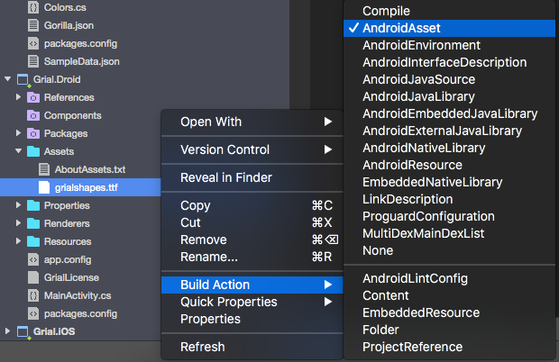
grialshapes.ttfto the/Assetsfolder on your Android project -
Select the file, and make sure the Build Action is set to:
"AndroidAsset"in the Properties tab. (It is normally its default setting).
Grial's theme is made on top of:
- Android theme and resources
- iOS appeareance
- Custom Renderers on Artina.Shared dll
- Styles on
App.xamlfile
Overview: You will need to copy specific files from the Grial.Droid project Resources folder to your Android project and set the theme on the MainActivity.cs file.
Important: Make sure you are using AppCompatV7 on you project!
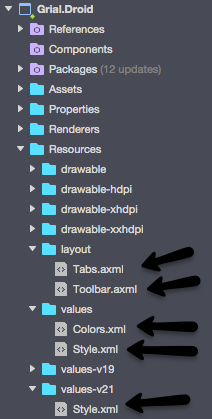
- Start by copying the "Colors.xml" file and the theme files, both are named "Style.xml" and can be found on the folders:
Grial.Droid
  |_ values
  |  |_ Colors.xml
  |  |_ Style.xml
  |
  |_ values-v21
    |_ Style.xml
You will need to paste them on the same location of your Android project.
These files are responsible for setting the colors and styles on Android apps.
- Also, you will need to copy the files "Tabs.axml" and "Toolbar.axml" on the layout folder:
Grial.Droid
  |_ layouts
    |_ Tabs.axml
    |_ Toolbar.axml
- Finally, you will need to set the splash and on the
OnCreateevent switch to the theme on yourMainActivity.cs. Just take a look at theMainActivity.csprovided with Grial sample on Grial.Droid project for better reference:
    ...
    namespace UXDivers.Artina.Grial

      {
        //https://developer.android.com/guide/topics/manifest/activity-element.html
        [Activity (
          Label = "Grial UIKit",
          Icon="@drawable/icon",
          Theme = "@style/Theme.Splash",
          MainLauncher = true,
          LaunchMode = LaunchMode.SingleTask,
          ConfigurationChanges = ConfigChanges.Orientation | ConfigChanges.ScreenSize
          )
        ]

        public class MainActivity : FormsAppCompatActivity
        {
          protected override void OnCreate (Bundle bundle)
          {
            // Changing to App's theme since we are OnCreate and we are ready to
            // "hide" the splash
            base.Window.RequestFeature(WindowFeatures.ActionBar);
            base.SetTheme(Resource.Style.AppTheme);

            base.OnCreate (bundle);

            global::Xamarin.Forms.Forms.Init (this, bundle);

            ...
          }
        }

      }
Overview: You will need to copy ThemeColors.cs file from the Grial.iOS project to your iOS project and you will need to invoke it from AppDelegate.cs file in order to get the styles applied.
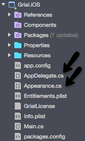
-
Copy "ThemeColors.cs" file from Grial sample to your iOS folder on your project. This file is the responsible for the styling iOS apps.
-
Finally, you will need to add this call on your
AppDelegate.csfile:
UXDivers.Artina.Shared.GrialKit.Init( new ThemeColors(), "UXDivers.Artina.Grial.GrialLicense" );
NOTE: Replace the above with your Grial license as explained on: Grial License Setup.
If you take over all the content of the App.xaml from the sample project, you app will crash on startup with an exception about not finding
UXDivers.Artina.Shared.iOS.dll.
Even though you have added a reference to the file in your iOS project, the linker cannot see it as you are not using directly from code, but only via the XAML files.
Therefore you need to add the AssemblyInfo.cs file from the sample project, which will make the linker include the
UXDivers.Artina.Shared.iOS.dll in your iOS build.
Grial makes use of several custom renderers declared on each platform through its own AssemblyInfo.cs file.
In order to get them available for your project you will need to add them to your AssemblyInfo.cs files on each project (PCL, Android, iOS).
NOTE: Depending on your needs, you could need to customize the Grial theme for your app. Also you could not need some of the custom renderers so in such case you can simply not declare them on your project.
- Open the file
AssemblyInfo.cson your Android project:
Grial.Droid
  |_ Properties
    |_ AssemblyInfo.cs
- Paste the custom renderers definitions from Grial sample's
AssemblyInfo.cs(also on the same folder form previous step):// Custom renderer definition. [assembly: ExportRenderer(typeof(Entry), typeof(UXDivers.Artina.Shared.ArtinaEntryRenderer))] [assembly: ExportRenderer(typeof(Editor), typeof(UXDivers.Artina.Shared.ArtinaEditorRenderer))] [assembly: ExportRenderer(typeof(Switch), typeof(UXDivers.Artina.Shared.ArtinaSwitchRenderer))] [assembly: ExportRenderer(typeof(ActivityIndicator), typeof(UXDivers.Artina.Shared.ArtinaActivityIndicatorRenderer))] [assembly: ExportRenderer(typeof(ProgressBar), typeof(UXDivers.Artina.Shared.ArtinaProgressBarRenderer))] [assembly: ExportRenderer(typeof(Slider), typeof(UXDivers.Artina.Shared.ArtinaSliderRenderer))] [assembly: ExportRenderer(typeof(SwitchCell), typeof(UXDivers.Artina.Shared.ArtinaSwitchCellRenderer))] [assembly: ExportRenderer(typeof(TextCell), typeof(UXDivers.Artina.Shared.ArtinaTextCellRenderer))] [assembly: ExportRenderer(typeof(ImageCell), typeof(UXDivers.Artina.Shared.ArtinaImageCellRenderer))] [assembly: ExportRenderer(typeof(ViewCell), typeof(UXDivers.Artina.Shared.ArtinaViewCellRenderer))] [assembly: ExportRenderer(typeof(EntryCell), typeof(UXDivers.Artina.Shared.ArtinaEntryCellRenderer))] [assembly: ExportRenderer(typeof(SearchBar), typeof(UXDivers.Artina.Shared.ArtinaSearchBarRenderer))] [assembly: ExportRenderer(typeof(UXDivers.Artina.Shared.Button), typeof(UXDivers.Artina.Shared.ArtinaButtonRenderer))]
- Open the file
AssemblyInfo.cson your iOS project:
Grial.iOS
  |_ Properties
    |_ AssemblyInfo.cs
- Paste the custom renderers definitions from Grial sample's
AssemblyInfo.cs(also on the same folder form previous step):// Custom renderer definition [assembly: ExportRenderer(typeof(UXDivers.Artina.Shared.CircleImage), typeof(UXDivers.Artina.Shared.ImageCircleRenderer))] [assembly: ExportRenderer(typeof(EntryCell), typeof(UXDivers.Artina.Shared.ArtinaEntryCellRenderer))] [assembly: ExportRenderer(typeof(ImageCell), typeof(UXDivers.Artina.Shared.ArtinaImageCellRenderer))] [assembly: ExportRenderer(typeof(SwitchCell), typeof(UXDivers.Artina.Shared.ArtinaSwitchCellRenderer))] [assembly: ExportRenderer(typeof(TableView), typeof(UXDivers.Artina.Shared.ArtinaTableRenderer))] [assembly: ExportRenderer(typeof(TextCell), typeof(UXDivers.Artina.Shared.ArtinaTextCellRenderer))] [assembly: ExportRenderer(typeof(ViewCell), typeof(UXDivers.Artina.Shared.ArtinaViewCellRenderer))] [assembly: ExportRenderer(typeof(Entry), typeof(UXDivers.Artina.Shared.ArtinaEntryRenderer))] [assembly: ExportRenderer(typeof(Picker), typeof(UXDivers.Artina.Shared.ArtinaPickerRenderer))] [assembly: ExportRenderer(typeof(DatePicker), typeof(UXDivers.Artina.Shared.ArtinaDatePickerRenderer))] [assembly: ExportRenderer(typeof(TimePicker), typeof(UXDivers.Artina.Shared.ArtinaTimePickerRenderer))] #pragma warning disable 219 internal static class WorkaroundLoadingCustomRenderersFromExternalAssemblies { static WorkaroundLoadingCustomRenderersFromExternalAssemblies() { var a = new UXDivers.Artina.Shared.ArtinaEntryRenderer(); } } #pragma warning restore 219
NOTE: Remember to add the required namespaces at the top of both AssemblyInfo.cs files:
using Xamarin.Forms;
using UXDivers.Artina;
TROUBLESHOOT
In case you get the following exception:
App.xaml file centralizes all the theme resources used (colors, values, images, styles, etc.) on Grial sample.
We recommend is just to copy them to your App.xaml file on your new project.
Probably you will not use all of them but you can do that optimization part -remove not used resources, move resources to specific pages that uses them- later.
The easiest way to make everything work at first will be just to copy everything.
Now that you have the needed infrastructure for Grial theme it is time for you to use the pages and templates.
Basically you will need to copy and paste pages (ContentPages) and its templates (ContentViews) from Grial Sample to your project.
Pages reference templates using xml namespaces defined on the header of the document. This is typically something like the following:
xmlns:views="clr-namespace:UXDivers.Artina.Grial;assembly=UXDivers.Artina.Grial"
Since your pages will be on another assembly, you will need to change at least the assembly name by the one from the PCL assembly where these pages will be:
xmlns:local="clr-namespace:YOUR_NAMESPACE_HERE;assembly=YOUR_ASSEMBLY_HERE"
If you need to change the namespace on the pages and templates (ContentViews) you will need to change also the "clr-namespace".
Here is an example for the MY_PROJECT project:
  <?xml version="1.0" encoding="UTF-8"?>
  <ContentView
    ...
    xmlns:views="clr-namespace:MY_PROJECT;assembly=MY_PROJECT"
    x:Class="MY_PROJECT.Badge"
    ...
  >
It will be also neccessary to change x:Class as the code behind.
On your project's code behind typically you will need to replace the sample data view models with your app's ones.
Finally, if you are using Gorilla Player remember to copy the DesignTimeData.json file from the Grial sample to your project to allow previewing it.
You will probably need to update your DesignTimeData.json file to correctly feed your views with data according to your pages/templates names and data structures.
For more info please check: https://github.com/UXDivers/Gorilla-Player-Support/wiki/Working-with-design-time-data
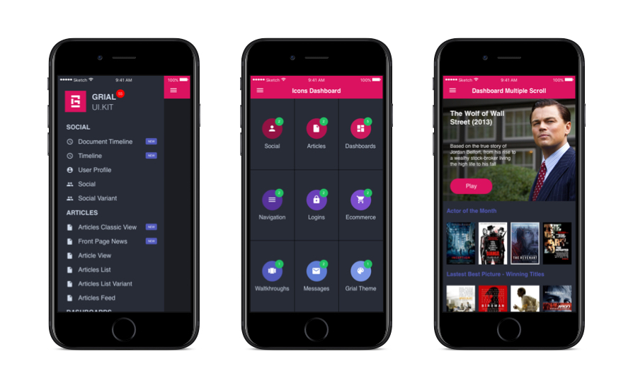
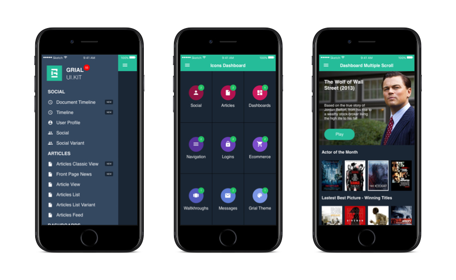
Grial provides templates which cover common UI patterns in mobile apps.
Each one of them is fully functional page sample, with its code behind and data bindings to help bootstrapping your app or prototype.
Basically the templates fit two categories, the Common ones:
   Grial
	|_ Views
		|_ Common
...and the specific ones:
   Grial
	|_ Views
		|_ Articles
		|_ Dashboards
		|_ Ecommerce
		|_ Logins
		|_ Messages
		|_ Navigation
		|_ Settings
		|_ Social
		|_ Theme
		|_ Walkthrough
Inside each category folder you will find sample pages and in most cases item templates (used as items in repeaters controls such as ListViews). Take a look at the Dashboards folder as an example:
   Grial
	|_ Views
		|_ Dashboards
			|_ Templates
			|	|_ DashboardItemTemplate.xaml
			|
			|_ DashboardWithImages.xaml
			|_ Dashboard.xaml
			|_ DashboardFlat.xaml
The "DashWidgetView.xaml" contains the common template that will be used in all of the dashboards pages.
Common views are ContentViews that are used often more than once in an app.
   Grial
	|_ Views
		|_ Common
			|_ Badge.xaml
			|_ BrandBlock.xaml
			|_ CircleIcon.xaml
			|_ CustomNavBar.xaml
			|_ CustomActivityIndicator.xaml
			|_ Rating.xaml
			|_ RoundedLabel.xaml
To visualize them simply run the sample app and go to:
Grial Theme > Grial Common Views
###Badge.xaml
This is a ContenView which mimics a Badge Control.
NOTE: You need to copy the Badge.xaml and its Badge.xaml.cs to your project in order to get this control available for your app.
To include it in your page first add the right namespace and assembly names for the xmlns:local:
You will also need to make sure the namespaces are the right ones.
For more info check Adding pages and templates to your project.
	<?xml version="1.0" encoding="UTF-8"?>
		<ContentPage
			...
			xmlns:local="clr-namespace:YOUR_NAMESPACE_HERE;assembly=YOUR_ASSEMBLY_HERE">
Then place it on your page:
	<local:Badge
		BadgeText="My Badge"
		BadgeTextColor="#FFFFFF"
		BadgeBackgroundColor="#FF0000"
	>
The bindable properties are:
- BadgeText String
- BadgeBackgroundColor Color
- BadgeTextColor Color
###BrandBlock.xaml###
This is a ContenView which holds the app logo and branding info.
To include it in your page first add the right namespace and assembly names for the xmlns:local:
You will also need to make sure the namespaces are the right ones.
For more info check Adding pages and templates to your project.
	<?xml version="1.0" encoding="UTF-8"?>
		<ContentPage
			...
			xmlns:local="clr-namespace:YOUR_NAMESPACE_HERE;assembly=YOUR_ASSEMBLY_HERE">
Then simply add it on our page:
<local:BrandBlock />
NOTE: This is not a bindable view. Make also sure you have added all the resources used by this view, like the image on the theme, its colors, styles and images available on the different projects (Android and iOS).
###CircleIcon.xaml###
This is a ContenView that renders an icon inside a circle.
To include it in your page first add the right namespace and assembly names for the xmlns:local:
You will also need to make sure the namespaces are the right ones.
For more info check Adding pages and templates to your project.
	<?xml version="1.0" encoding="UTF-8"?>
		<ContentPage
			...
			xmlns:local="clr-namespace:YOUR_NAMESPACE_HERE;assembly=YOUR_ASSEMBLY_HERE">
Then simply add it on our page:
<commonViews:CircleIcon />
NOTE: This is not a bindable view.
Make sure you are using grialshapes.ttf and got all its setup made in order to get the right visualization.
For more info, check Adding Font Icons To Your Project
###CustomNavBar.xaml###
This is a ContenView which aims to replace standard ActionBar/NavBar. If you use it on a Master/Detail page it will trigger the menu states (presented or not).
The main benefits are that:
- You can fully customize the look and feel and use font icons
- It will be displayed over the NavBar/ActionBar
To make it look as native on your app, first you need to hide the real NavBar/ActionBar. To achieve it, simply go to the code behind file of your page and add the following:
InitializeComponent ();
NavigationPage.SetHasNavigationBar(this, false);
To include it in your page first add the right namespace and assembly names for the xmlns:local:
You will also need to make sure the namespaces are the right ones.
For more info check Adding pages and templates to your project.
	<?xml version="1.0" encoding="UTF-8"?>
		<ContentPage
			...
			xmlns:local="clr-namespace:YOUR_NAMESPACE_HERE;assembly=YOUR_ASSEMBLY_HERE">
Then simply add it on our page:
<local:CustomNavBar />
Note: This is not a bindable view.
###CustomActivityIndicator.xaml###
This is a ContenView which contains an animated logo of your brand which you can use for instance to show a loading message while your app is fetching information.
NOTE: You need to copy the CustomActivityIndicator.xaml and its CustomActivityIndicator.xaml.cs to your project in order to get this control available for your app.
You will also need to make sure the namespaces are the right ones.
For more info check Adding pages and templates to your project.
To include it in your page first add the namespace:
	<?xml version="1.0" encoding="UTF-8"?>
		<ContentPage
			...
			xmlns:local="clr-namespace:YOUR_NAMESPACE_HERE;assembly=YOUR_ASSEMBLY_HERE">
Then simply add it on our page:
<local:CustomActivityIndicator />
NOTE: This is not a bindable view.
###Rating.xaml###
Rating is an easy way for users to voice their opinion about a certain object.
NOTE: You need to copy the Rating.xaml and its Rating.xaml.cs to your project in order to get this control available on your project.
To include it in your page first add the right namespace and assembly names for the xmlns:local:
You will also need to make sure the namespaces are the right ones.
For more info check Adding pages and templates to your project.
	<?xml version="1.0" encoding="UTF-8"?>
		<ContentPage
			...
			xmlns:local="clr-namespace:YOUR_NAMESPACE_HERE;assembly=YOUR_ASSEMBLY_HERE">
Then simply add it on our page:
	<local:Rating
        Max="10"
        Value="5" />
The bindable properties are:
- Value Double
- Max Double
###RoundedLabel.xaml###
The RoundedLabel as its name suggests, is just a <Label/> with rounded corners.
NOTE: You need to copy the RoundedLabel.xaml and its RoundedLabel.xaml.cs to your project in order to get this control available for your app.
You will also need to make sure the namespaces are the right ones.
For more info check Adding pages and templates to your project.
To include it in your page add the namespace:
	<?xml version="1.0" encoding="UTF-8"?>
		<ContentPage
			...
			xmlns:local="clr-namespace:YOUR_NAMESPACE_HERE;assembly=YOUR_ASSEMBLY_HERE">
Then simply add it on our page:
	<local:RoundedLabel
		RoundedLabelText="Hello Rounded World!"
		RoundedLabelTextColor="White"
		RoundedLabelBackgroundColor="#00FF00"
		RoundedLabelCornerRadius="4"
		RoundedLabelPadding="6,0"
		RoundedLabelFontSize="10"
	/>
The bindable properties are:
- RoundedLabelText String
- RoundedLabelTextColor Color
- RoundedLabelBackgroundColor Color
- RoundedLabelCornerRadius Double
- RoundedLabelPadding Thickness
- RoundedLabelFontSize Double
The Specific views are examples of pages that belongs to certain categories which implement common UI patterns to help users achieve specific goals.
Typically they use templates for rendering items inside ListViews or in looped items.
Artina Grial follows the following convention:
Grial
|_ Views
	|_ <CATEGORY NAME>
		|_ <PAGE NAME>Page.xaml
		|_ Templates
			|_ <PAGE NAME>ItemTemplate.xaml
The articles views and their item templates are used to display blog posts, articles, feeds, etc.
Grial
|_ Views
	|_ Articles
The Dashboards views and their item templates are used to display nice looking categories.
   Grial
	|_ Views
		|_ Dashboards
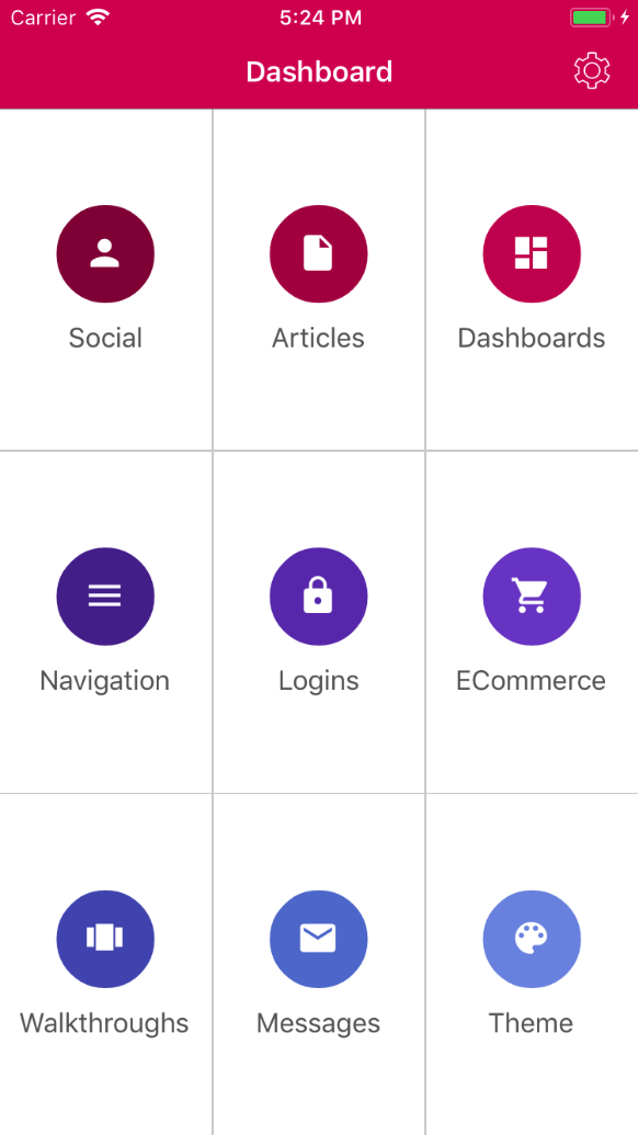
There are 3 available dashboards visualizations available in Artina Grial:
- Default (Dashboard.xaml)
- A dashboard displaying circled icons
- Flat (DashboardFlat.xaml)
- A variation from previous one displaying rectangular tiles for each item
- Images (DashboardWithImages.xaml)
- Another variation using icons and images as background
The Ecommerce views and their item templates are used to display products lists and products previews.
Grial
|_ Views
	|_ Ecommerce
The Logins views are used to sign-in, sign-up, login and password recovery pages.
Grial
|_ Views
	|_ Logins
The Logins views shows how to use validations and display error and warning messages.
###Messages###
The Messages views and their item templates are used to display email like UIs and chats/instant messaging UIs.
Grial
|_ Views
	|_ Messages
###Navigation###
The Navigation views are -as their name suggests- used for navigation purposes.
Basically there are 3 types:
-
Master/Detail (RootPage.xaml)
- A Page that manages two panes of information: A master page that presents data at a high level, and a detail page that displays low-level details about information in the master.
-
Lists
- Acts as proxies through categories navigations. They are similar to Dashboards but they are used to display much more information through ListViews.
-
Custom Navigation Bar Page Sample
- This is a sample showing the use of the common view
<commonViews:CustomNavBar />
|_ Grial |_ Views |_ Navigation
- This is a sample showing the use of the common view
###Settings###
The Settings views are used -as its name suggest- for displaying settings. Particularly, this sample illustrates the usage of Xamarin Forms TableViews with intent "Settings".
Grial
|_ Views
	|_ Settings
###Social###
The Social views and their item templates are used to display users social profiles, friends lists and image galleries.
Grial
|_ Views
	|_ Social
One of the remarkable features of this category is the use of subtle animations to improve the UX and also an image gallery specially implemented for Xamarin Forms.
###Theme###
The Theme views are mainly created to showcase the style features on Artina Grial.
Grial
|_ Views
	|_ Theme
One of the remarkable features of this category is the use of <WebView>
###Walkthroughs###
The Walkthroughs views and their item templates are used to explain users the main features of your app. Think of it as a "tutorial mode" where the UI demonstrate features to the user.
Grial
|_ Views
	|_ Walkthroughs
We have created 2 types of walkthough to serve different purposes:
- Default
(WalkthroughPage.xaml)- This type is intended to be used when you count with a design team who can provide you with images. These are ideal for final apps.
- Variant
(WalkthroughVariantPage.xaml)- This type was specially created for devs who lacks of a design team. These are also very useful while building prototypes.
- Variant
(WalkthroughFlatPage.xaml)- This type is a beautiful walkthough variation design ideal for final apps.