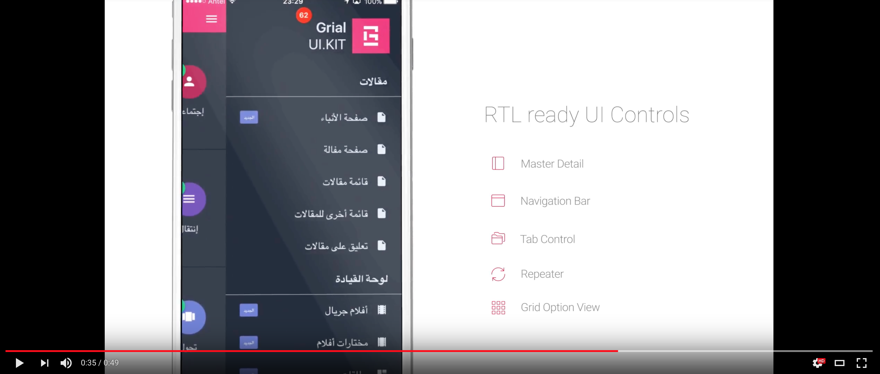
Initially, Grial was made for the Left-to-right (LTR) market but due to the great requests received we decided to make the product Right-to-left (RTL) enabled.
Grial RTL provides 70+ screens and templates that now support both LTR and RTL using the exact same XAML code! Moreover, you can go from LTR to RTL culture (e.g. English to Arabic) without leaving the App, the pages will react to the change immediately.
If you are interested in this, you will probably be interested to read about Grial localization.
Yes! A single XAML codebase that works for both LTR and RTL with no duplicated chunks of code with conditional visibility or other complexities.
Xamarin Forms layouts (e.g. Grids and StackLayouts) are not aware of the Layout Direction of the device and so they stay the same regardless of that direction.
With Grial's built-in mirroring mechanism, all your layouts will be magically mirrored if needed. Take a look at this item template:
It's built by combining Grids and StackLayouts. Grial mirroring mechanism turns it into this on the fly:
As you can see, the image that was in the first column is now in the second one. One Grid, two layouts :)
Mirroring is accessed by two attached properties.
The first and most important is the boolean property Mirror that indicates if a chunk of xaml needs to be mirrored or not.
The following example shows how to permanently mirror a Grid and its children (not very useful in most scenarios, but serves as an example):
<Grid rtl:Rtl.Mirror="true">
	...
</Grid>
Note that rtl namespace needs to be declared like this:
xmlns:rtl="clr-namespace:UXDivers.Artina.Shared;assembly=UXDivers.Artina.Shared.Base"
Grial defines a set of implicit styles in the App.xaml that define this property to make the mirroring both transparent (you don't have to think about it in your pages) and dynamic (it honors the actual Layout Direction on the device). For instance:
<Style TargetType="Grid" ApplyToDerivedTypes="true">
	<Setter Property="rtl:Rtl.Mirror" Value="{ DynamicResource IsRtl }" />
</Style>
The IsRtl resource is a boolean value that is declared as false in Grial LTR themes, and as true in Grial RTL themes.
<!-- LTR Theme -->
<x:Boolean x:Key="IsRtl">True</x:Boolean>
<!-- RTL Theme -->
<x:Boolean x:Key="IsRtl">True</x:Boolean>
This will automatically mirror all your Application if you use an RTL theme, or, if at runtime you switch to one of those. More on the Themes section below.
The other attached property is MirrorBehavior whose possible values are: Normal, Skip and SkipSelf.
Normalis the default value, ifMirror == truethe control will be mirrored.Skipwill prevent the control and its children to be mirrored regardless of the value inMirror.SkipSelfskips the control mirroring but does not say anything about its children, so, by default, they will be mirrored whenMirror == true.
One cool feature is that Grial supports switching from LTR to RTL cultures of a running Application without the need to restart!
This works based on three pillars:
- The mirroring mechanism explained above that is in charge of mirroring your layouts.
- A set of RTL aware custom renderers that change the direction of native pieces like navigation bars.
- The Grial themes that are adjusted to style both LTR and RTL layouts.
Let's talk about custom renders and themes.
Our custom renderers make certain native components to be aware of the Layout Direction of the device in both Android and iOS. For instance:
Currently these are covered for both Android and iOS:
- NavigationBar
- MasterDetail
- TabbedPage
More to come :)
Each of our themes now supports its RTL version (light, dark, enterprise).
We've already explained the layout structure mirroring above. But what happens for instance if, inside a Grid cell,an element should change its HorizontalOptions form Start to End? Our themes comes with predefine values for common scenarios like this.
The following are the properties used to handle the proper alignment of layouts and texts in the context of a RTL or LTR app:
LayoutDirectionHorizontalOptions- Used to control the layout horizontal alignment matching the default alignment for the culture (RTL or LTR)
LayoutDirectionInverseHorizontalOptions- Used to control the layout horizontal alignment pointing in the opposite direction as the default for the culture (RTL or LTR)
LayoutDirectionHorizontalTextAlignment- Used to control the text alignment matching the default alignment for the culture (RTL or LTR)
LayoutDirectionInverseHorizontalTextAlignment- Used to control the text alignment pointing in the opposite direction as the default for the culture (RTL or LTR)
We have defined implicit styles on App.xaml to use by default the above properties making the job easier for you.
In case you could need to extend our templates you should use those properties to make sure your UI will look flawesly on RTL/LTR.
For example, suppose you need to make a button to be aligned on the right for a LTR App page. Then, you could use something like the following:
	<StackLayout>
		<Button
			Text="Tap me!"
			Width="100"
			HorizontalOptions="{ DynamicResource LayoutDirectionInverseHorizontalOptions }"
		/>
	</StackLayout>
If you switch to RTL you will get exactly the same but the button will be automatically aligned to the left without needing to make any further change on your layouts.
Sometimes layouts require more specific tweaks to get precise results. Paddings, margins, translations, rotations, etc., sometimes change in the context of RTL <> LTR.
For those cases, specific properties should be added to your themes.
Take a look at our themes, you will find examples of properties like the following which change in the context of RTL:
DashboardItemBadgeTranslationX
This property adds TranslationX property to badges to move them horizontally a certain amount of pixels.
If you open any of the LTR themes you will find this property value is:
<!-- Dashboard Item Template  -->
<x:Double x:Key="DashboardItemBadgeTranslationX">20</x:Double>
...but if you check on the RTL version of same theme you will find the value is different:
<!-- Dashboard Item Template  -->
<x:Double x:Key="DashboardItemBadgeTranslationX">-20</x:Double>
Grial provides a service that implements ILayoutDirectionService interface that provides the API to interact with the device layout direction. To access it you can do:
var layoutDirectionService = DependencyService.Get<ILayoutDirectionServiceLocator>().Service;
It provides:
a) A property to access the current Application's Layout Direction
LayoutDirection LayoutDirection { get; }
b) An event that notifies when the direction changes
event EventHandler LayoutDirectionChanged
c) A method to simulate a layout direction change
void SimulateLayoutDirectionChange(LayoutDirection direction)
The LayoutDirection property always matches the actual device Layout Direction unless at some point the SimulateLayoutDirectionChange method of the ILayoutDirectionService.
The Grial Theme used in the Application at runtime should be RTL or RTL depending on the LayoutDirection property value of this
service. If you need to support both LTR and RTL cultures, you should change the Theme of the app with these lines of code:
Application.Current.Resources.MergedWith =
	layoutDirectionService.LayoutDirection == LayoutDirection.Ltr ?
		typeof(GrialLightTheme) :
		typeof(GrialLightRtlTheme);
Using of course, your custom theme types.
If you are going to let the user change the Application culture as an in-app setting, you need to call the SimulateLayoutDirectionChange method if
the simulated culture direction does not match the device one. Remeber to read this too: i18n section.
##Gorilla Player previewing RTL Themes
Gorilla Player can preview Grial RTL Themes very easily. You just need to merge the RTL theme
on top of the App.xaml like this:
	<Application.Resources>
		<ResourceDictionary MergedWith="local:GrialLightRtlTheme">
Gorilla will take the contents of the RTL theme and render everything with it. If you want to see the LTR version just change that line back to the original theme.
Grial RTL-based Applications will support LTR and RTL layouts with the same XAML code.
All these UI pieces fully support RTL:
- NavigationBar
- MasterDetail
- TabControl
- TabbedPage
- Repeater
- GridOptionsView
- WrapPanel
- Pickers
- Entries
- Editors
- Ratings
Finally, it's possible to offer an App-level setting to change the culture even between RTL and RTL as the UI will react immediately.


