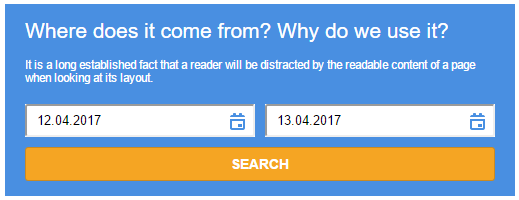
A date-range picker widget for Travelpayouts company of Aviasales OTA
(Link for the initial assignment https://github.com/KosyanMedia/Front-end_TP_test)
Execute following commands in your terminal
git clone https://github.com/wzup/aviasales-widget.gitcd aviasales-widgetnpm installnpm start- Visit http://localhost:3000/ in your browser
Evething is already pre-installed and set up in this demo.
To see html set up, open /views/index.html
To see widget's code, open /src/js/Widget.js
To see Webpack configuration, open /webpack/development.browser.js
The widget is run as any other widget out there - you import widget's CSS styles and JavaScript code on your page. Initialize it and run it.
However, below is a detailed explanation.
- Import widget's CSS styles on a page right before closing
</head>tag.
<head>
    ... your stuff ...
    <link rel="stylesheet" href="//localhost:3000/css/sa_widget.css">
</head>
- Import widget's JavaScript SDK code. Right below opening
<body>tag.
<body>
    <script src="//localhost:3000/js/sdk.js" type="application/javascript" charset="utf-8"></script>
- Initialize the widget.
<script type="application/javascript" charset="utf-8">
    AS.init({
        appId: '12345',
        id: 'as_widget',
        locale: 'en',
        version: 'v1.0',

        // button_color: 'red',
        // bg_color: 'aqua',
        // font_color: 'green'
    });
</script>
ASmeans "Aviasales". It is a namespace for widget's properties and methods. A namespace is used to avoid polluting globalwindowscope.initis a method to initialize and run the widget.
let params = { bg_color: 'red', id: 'as_widget' };
AS.init(params);
idis an arbitraryidattribute of any block node you want your widget be inserted to. It is a mandatory option.
<section id="sa-widget">
    ... widget will be inserted into this "section" node
</section>
-
Since this is a demo widget, only these three options are used to modify widget's look:
button_color- a background color for "SEARCH" button of the widget; dafault is#f5a523.bg_color- a background color of the widget itself; dafault is#498fe1.font_color- a text color for any text inside the widget; dafault is#fff.
So, to modify widget's look, uncomment those three options and provide desired colors, like shown above.
No need to restart Node.js server after you have changed widget options.
That's all.
All required tasks have been implemented:
-
The widget is responsive. Min width == 200px, max width == 1024px;
-
All three requred features have been utilized -
webpack,PostCSSиSVG. -
Date pickers have been added to date picker fields.
-
Customization of colors have been implemented.
