“Visualization is not an accessory to analysis — it’s the language through which data speaks.”
This is a collection of reproducible examples demonstrating how to transform raw data into visual stories using R. The project explores a variety of datasets and visualization techniques, showing how the R ecosystem enables creative and transparent data communication.
Each example highlights a different aspect of visualization, from exploratory graphics to storytelling and mapping, using open data from the #TidyTuesday, #30DayChartChallenge, #30daymapchallenge, and #duboischallenge projects and other public sources.
Data visualization is not just about making charts, it’s about understanding patterns, communicating insights, and promoting reproducibility.
This repository aims to help learners and practitioners:
- Discover the versatility of R for visual analytics;
- Learn by example through real-world datasets;
- Apply principles of clarity, design, and reproducibility.
The repository is organized into thematic sections, including:
- Basics of ggplot2 – foundational plots and aesthetic mapping
- Advanced Visualizations – facets, themes, and custom functions
- Spatial Data – creating maps with
sf,rnaturalearth, andggplot2 - Interactive Graphics – visualizing data dynamically with
plotlyandleaflet - Case Studies – reproducible analyses from #TidyTuesday datasets
Each folder contains a Quarto (.qmd) or R Markdown (.Rmd) file, code snippets, and rendered output.
The examples make use of several core packages from the R ecosystem:
library(ggplot2)
library(dplyr)
library(tidyr)
library(sf)
library(viridis)
library(patchwork)
library(rnaturalearth)
Other packages such as plotly, leaflet, and gganimate are introduced for interactive and animated graphics.
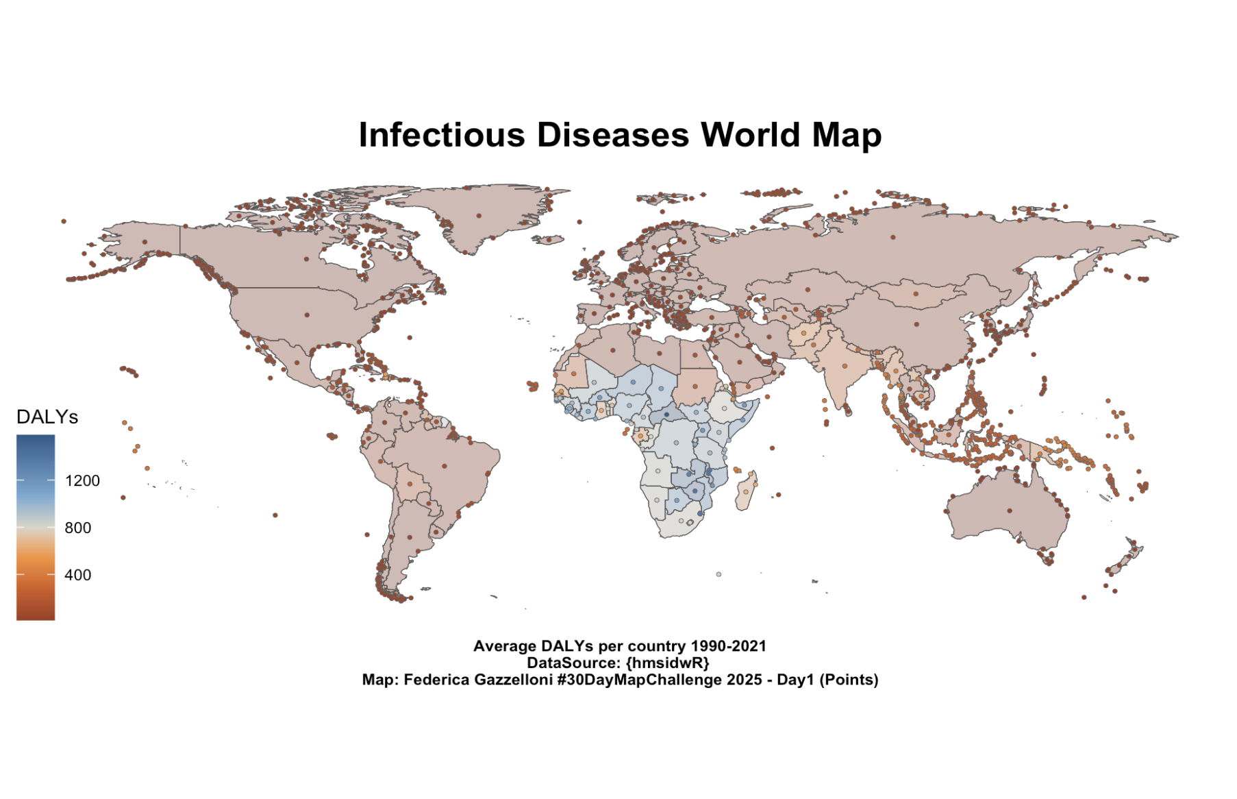
One featured example visualizes Disability-Adjusted Life Years (DALYs) across countries from 1990–2021 — created for Day 1 (“Points”) of the #30DayMapChallenge. Each point represents the centroid of a country, coloured according to its average DALY value, revealing global disparities in infectious disease burden.
Clone this repository and open it in RStudio or VS Code:
git clone https://github.com/<your-username>/data-visualization-with-R.git
quarto::quarto_render("path/to/file.qmd")
All examples are self-contained and reproducible.
This project is licensed under the MIT License.
Developed and maintained by Federica Gazzelloni 📧 [email protected] 🌐 federicagazzelloni.com