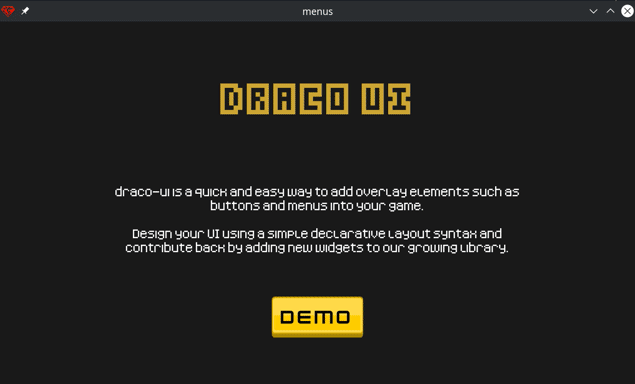
draco-ui is a quick and easy way to add overlay elements such as buttons and menus into your game.
Design your UI using a simple declarative layout syntax and contribute back by adding new widgets to our growing library.
A quick code sample, just to give you an idea...
panel {
  width 600
  height 600

  layout {
    align :center
    space :evenly
    padding 32

    label {
      text 'Panel'
      size 42
      font 'fonts/kenney-fonts/blocks.ttf'
    }

    label {
      text 'This is a panel'
      size 4
      padding 0
      font 'fonts/kenney-fonts/pixel.ttf'
    }

    button {
      text 'Quit Game'
      variant :red
      size 16
      padding 24
      on_click ->(entity, world, args) {
        $gtk.request_quit
      }
    }
  }
}
Check the examples/ directory for a complete demo containing several more examples you can learn from.
If you don't already have a game project, run smaug new to create one.
$ smaug add draco
$ smaug add draco-common
$ smaug add draco-state
$ smaug add draco-events
$ smaug add color
$ smaug add kenney-ui-pack
$ smaug add kenney-fonts
$ smaug add kenney-game-icons
And then...
$ smaug add draco-ui
$ smaug install
# app/main.rb
require 'smaug.rb'
def tick args
args.state.world ||= HelloWorld.new
args.state.world.tick(args)
endNext, create a World and include Draco::UI.
# app/worlds/hello_world.rb
class HelloWorld < Draco::World
  include Draco::UI
end
Start the game with smaug run, and your UI should appear.
Wrap entities in a Layout to automatically position them relative to each other and the parent or grid.
| Attribute | Default | Valid | Note |
|---|---|---|---|
| align | :center | :center, :left, :right | Sets the horizontal position of all entities inside the layout relative to the parent. If the layout has no parent, alignment is relative to the grid. |
| space | :evenly | :evenly, :start, :end | Distribute entities evenly spaced over the height of the parent (or grid), or push them to the top or bottom. |
| padding | 0 | Integer | Set a distance from all edges of the parent for entities nested inside of the layout to be placed |
| orientation | :vertical | :vertical | Not implemented |
layout {
  align :center
  space :evenly
  padding 24
  orientation :vertical

  # Nested entities...
  button { text 'Button 1' }
  button { text 'Button 2' }
}Display single or multiple lines of text content.
| Attribute | Default | Valid | Note |
|---|---|---|---|
| text | nil | String | Text will be line-wrapped at 65 characters |
| size | 0 | Integer | Value given to args.outputs.labels (SIZE_ENUM). 0 represents "default size". A negative value will decrease the label size. A positive value will increase the label's size. |
| padding | 0 | Integer | Add space to all sides of the label |
| font | Subject to change | Relative path to a TrueType font | Not implemented |
| color | '#ffffff'.to_color | Color | Color may be expressed in any format understood by https://smaug.dev/packages/color/ |
| width | 0 | Integer | Width |
| height | 42 | Integer | Height |
# Headline
label {
  padding 0
  text 'Hello World'
  size 42
  color '#cca533ff'
  font 'fonts/Fonts/Kenney Blocks.ttf'
}

# Paragraph
label {
  text <<-TEXT
  Lorem ipsum dolor sit amet, consectetur adipiscing elit.
  Aliquam eget dolor venenatis, fermentum enim quis, faucibus enim.
  Vivamus elementum mattis ornare.
  TEXT
  size 4
  font 'fonts/Fonts/Kenney Pixel.ttf'
}Create a panel to display a visual container for your content.
| Attribute | Default | Valid | Note |
|---|---|---|---|
| width | 100 | Integer | Set the width of the panel |
| height | 100 | Integer | Set the height of the panel |
| path | sprites/kenney-ui-pack/blue_panel.png | Relative path | Sprite path for panel image |
| color | Color | Tint color |
panel {
  width $gtk.args.grid.w
  height 400
  layout {
    label {
      text 'Example Panel'
    }
  }
}A clickable, customizable all-purpose button control.
| Attribute | Default | Valid | Note |
|---|---|---|---|
| text | 100 | Integer | Button label |
| size | 0 | Integer | SIZE_ENUM |
| padding | 12 | Integer | Space between the content and the edges of the button |
| variant | 'blue' | String or Symbol | Any value supported by your StatefulSprite :dynamic_path |
| on_click | Proc | ->(entity, world, args) { #... } |
button {
  text 'Confirm'
  variant :green
  size 16
  padding 24
  icon {
    path 'sprites/kenney-game-icons/white/2x/larger.png'
  }
  on_click ->(entity, world, args) {
    # ...Anything you want!
  }
}A clickable icon without a label.
| Attribute | Default | Valid | Note |
|---|---|---|---|
| width | 32 | Integer | Set the width of the icon |
| height | 32 | Integer | Set the height of the icon |
| path | Relative path | Sprite path for icon image | |
| color | Color | Tint color | |
| on_click | Proc | ->(entity, world, args) { #... } |
icon {
  width 100
  height 100
  path 'sprites/kenney-game-icons/white/2x/larger.png'
  on_click ->(entity, world, args) {
    # ...Anything you want!
  }
}An animated progress bar.
| Attribute | Default | Valid | Note |
|---|---|---|---|
| width | 400 | Integer | Set the width of the progress bar |
| height | 42 | Integer | Set the height of the progress bar |
| speed | 1 | Integer | Rate of change when animating |
| max | 100 | Integer | Maximum possible value in range |
| background | sprites/draco-ui/progress/background_01.png | Relative path | Sprite path for background image |
| fill | sprites/draco-ui/progress/background_03.png | Relative path | Sprite path for fill image |
| value | -> { 0 } |
Proc | Returns the current value every tick |
progress {
  width 400
  height 42
  speed 1
  max 100
  background 'sprites/draco-ui/progress/background_01.png'
  fill 'sprites/draco-ui/progress/background_04.png'
  value -> { 90 }
}Display a notification message to the player.
| Attribute | Default | Valid | Note |
|---|---|---|---|
| width | 100 | Integer | Set the width of the banner |
| height | 100 | Integer | Set the height of the banner |
| path | sprites/kenney-ui-pack/red_panel.png | Relative path | Sprite path for banner image |
| color | Color | Tint color |
Banner.notify do
  label { text "This is a banner" }
end