-
Notifications
You must be signed in to change notification settings - Fork 30
scRNAtoolVis documentation.
This package mainly is used to replot seurat default plot and with other interesting functions. I will add other functions into this package in the future.
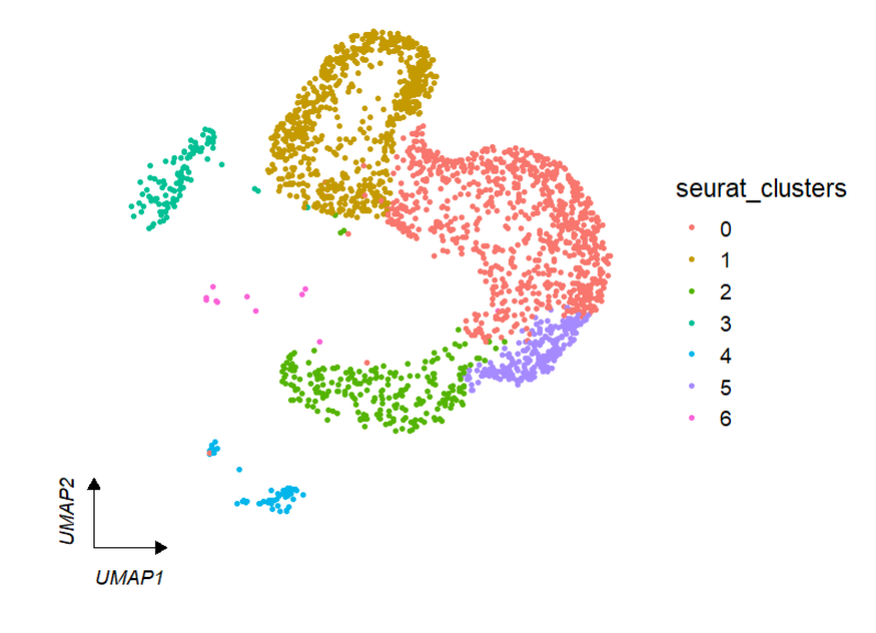
clusterCornerAxes is used to add corner axis on the left-bottom UMAP/tSNE principle component plot.
We load test data in scRNAtoolVis package:
test <- system.file("extdata", "seuratTest.RDS", package = "scRNAtoolVis")
tmp <- readRDS(test)
default plot:
# umap
clusterCornerAxes(object = tmp,reduction = 'umap',
                  noSplit = T)
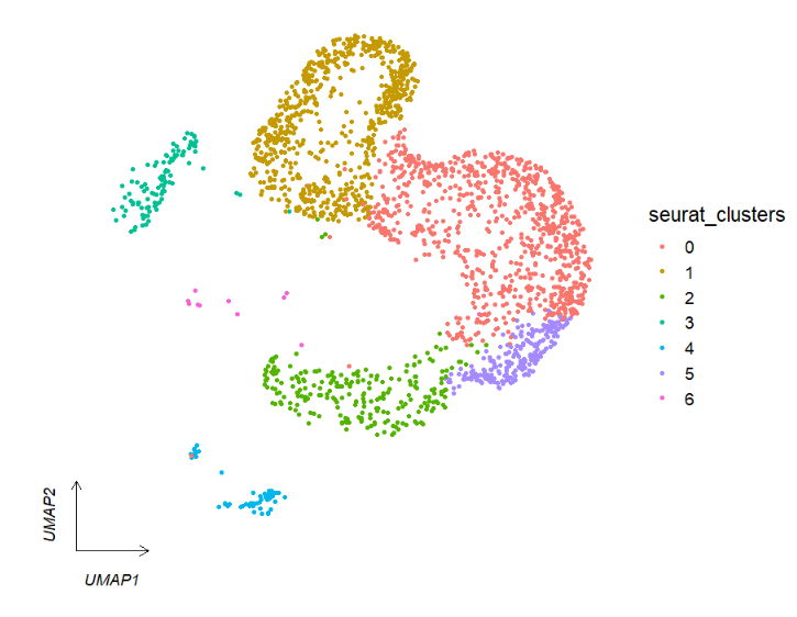
We can change arrow type:
# arrowType
clusterCornerAxes(object = tmp,reduction = 'umap',
                  noSplit = T,arrowType = 'open')
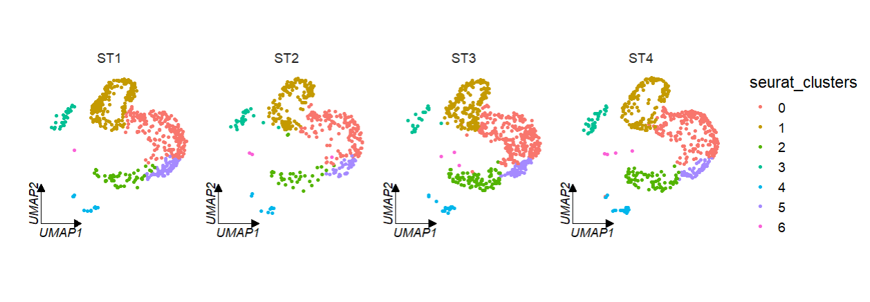
We can facet by seurat metadata column catogary variable:
# facet by metadata column "orig.ident"
clusterCornerAxes(object = tmp,reduction = 'umap',
                  noSplit = F,groupFacet = 'orig.ident',
                  relLength = 0.5)
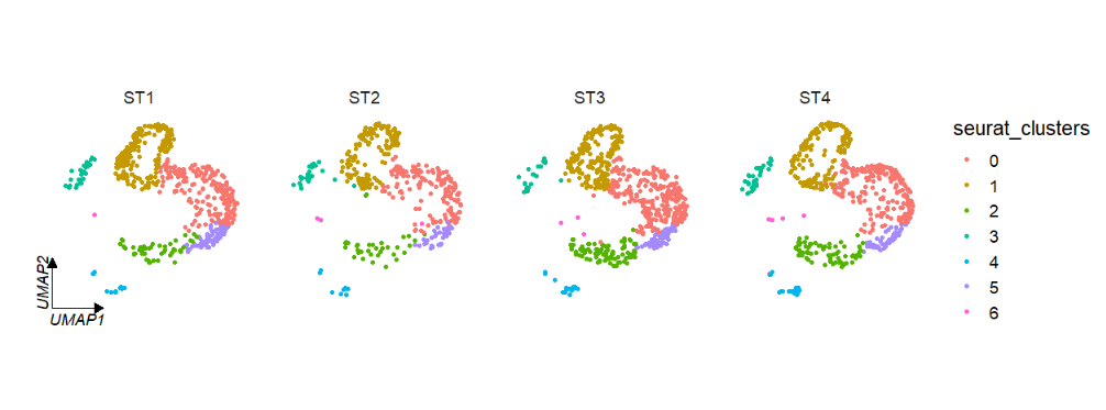
If multiple corner axises will confuse you, you can also set axes = 'one' to retain only one axis on the left:
# retain only one axes
clusterCornerAxes(object = tmp,reduction = 'umap',
                  noSplit = F,groupFacet = 'orig.ident',
                  relLength = 0.5,
                  axes = 'one')
Change the axis and label color:
# line color
clusterCornerAxes(object = tmp,reduction = 'umap',
                  noSplit = F,groupFacet = 'orig.ident',
                  relLength = 0.5,
                  lineTextcol = 'grey50')
Use tSNE reduction data:
# tsne
clusterCornerAxes(object = tmp,reduction = 'tsne',
                  noSplit = F,groupFacet = 'orig.ident',
                  relLength = 0.5)
Change a cool theme:
clusterCornerAxes(object = tmp,
                  reduction = 'umap',
                  noSplit = F,
                  groupFacet = 'orig.ident',
                  relLength = 0.5,
                  cornerTextSize = 4,
                  themebg = 'bwCorner')
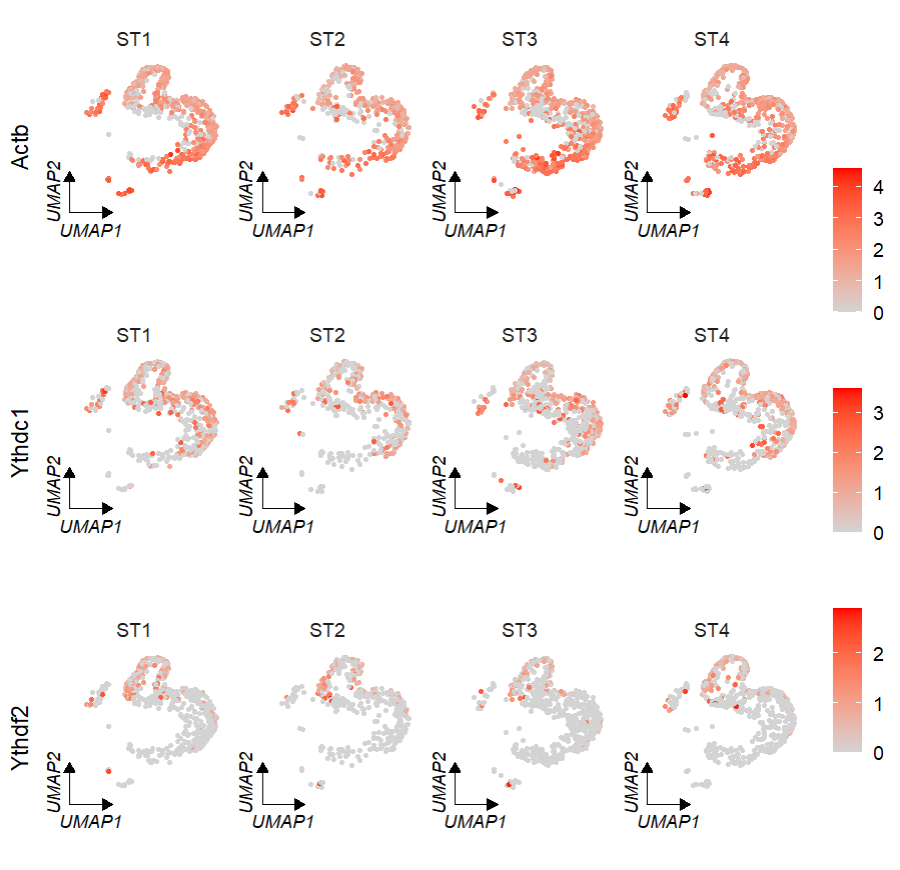
FeatureCornerAxes is used to add corner axises on the gene expression reduction map:
# umap
FeatureCornerAxes(object = tmp,reduction = 'umap',
                  groupFacet = 'orig.ident',
                  relLength = 0.5,relDist = 0.2,
                  features = c("Actb","Ythdc1", "Ythdf2"))
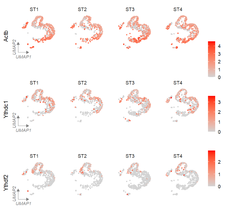
Keep one axis:
# one axes
FeatureCornerAxes(object = tmp,reduction = 'umap',
                  groupFacet = 'orig.ident',
                  features = c("Actb","Ythdc1", "Ythdf2"),
                  relLength = 0.5,relDist = 0.2,
                  axes = 'one',
                  lineTextcol = 'grey50')
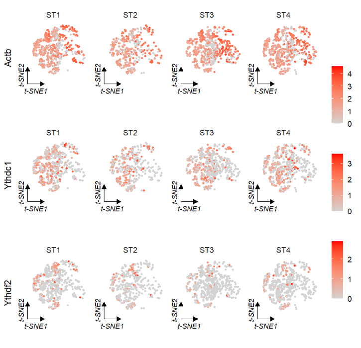
tSNE reduction:
# tsne
FeatureCornerAxes(object = tmp,reduction = 'tsne',
                  groupFacet = 'orig.ident',
                  relLength = 0.5,relDist = 0.2,
                  features = c("Actb","Ythdc1", "Ythdf2"))
Change a cool theme:
# umap
FeatureCornerAxes(object = tmp,reduction = 'umap',
                  groupFacet = 'orig.ident',
                  features = c("Actb","Ythdc1"),
                  cornerTextSize = 3,
                  themebg = 'bwCorner')
Add circle on clusters:
# add circle
clusterCornerAxes(object = tmp,reduction = 'umap',
                  noSplit = T,
                  cornerTextSize = 3.5,
                  themebg = 'bwCorner',
                  addCircle = TRUE,
                  cicAlpha = 0.2,
                  nbin = 200)
Relative parameters to control the circle as follows:

AverageHeatmap is used to plot averaged expression cross cluster cells.
load data:
httest <- system.file("extdata", "htdata.RDS", package = "scRNAtoolVis")
pbmc <- readRDS(httest)

# load markergene
markergene <- system.file("extdata", "top5pbmc.markers.csv", package = "scRNAtoolVis")
markers <- read.table(markergene, sep = ',', header = TRUE)
plot:
# plot
AverageHeatmap(object = pbmc,
               markerGene = markers$gene)
change color:
# change color
AverageHeatmap(object = pbmc,
               markerGene = markers$gene,
               htCol = c("#339933", "#FFCC00", "#FF0033"))
Supporting with your own cluster colors by annoCol = TRUE and myanCol:
# change annotation color
library("scales")
library(ggsci)

mycol <- hue_pal()(9)
mycol1 <- pal_npg()(9)

# plot
AverageHeatmap(object = pbmc,
               markerGene = markers$gene,
               annoCol = TRUE,
               myanCol = mycol) +
  AverageHeatmap(object = pbmc,
                 markerGene = markers$gene,
                 annoCol = TRUE,
                 myanCol = mycol1)
markerVocalno is used to plot vocalnoplot of marker genes:
test <- system.file("extdata", "pbmc.markers.csv", package = "scRNAtoolVis")
markers <- read.csv(test)

# plot
markerVocalno(markers = markers,
              topn = 5,
              labelCol = ggsci::pal_npg()(9))

More parameters refer to:
?clusterCornerAxes
?FeatureCornerAxes
?AverageHeatmap
The scRNAtoolVis 0.0.4 version supplies a jjDotPlot function to visualize gene expressions in a elegant way.
