A daily data visualization challenge held every April, celebrating the art of chart-making.
The #30DayChartChallenge is an annual community-driven event where participants create one visualization per day throughout April. Each day features a specific chart type or theme—from comparisons and distributions to relationships and storytelling—pushing you to explore new techniques and expand your visualization toolkit.
More information available at the 30DayChartChallenge GitHub.
A look at the R ecosystem I use to transform raw data into insights:
- Core:
tidyverse(dplyr, ggplot2, tidyr) for data manipulation and visualization. - Typography & Styling:
showtextfor custom fonts andggtextfor markdown-enhanced labels. - Layout:
patchworkfor multi-plot compositions andherefor robust file path management. - Formatting:
gluefor dynamic labeling and custom R scripts for summary visualizations.
Connect with me and see my latest work:
| Year | Status | Progress |
|---|---|---|
| 2025 | 🏁 Completed | 30 / 30 days |
| 2024 | 🏁 Completed | 30 / 30 days |
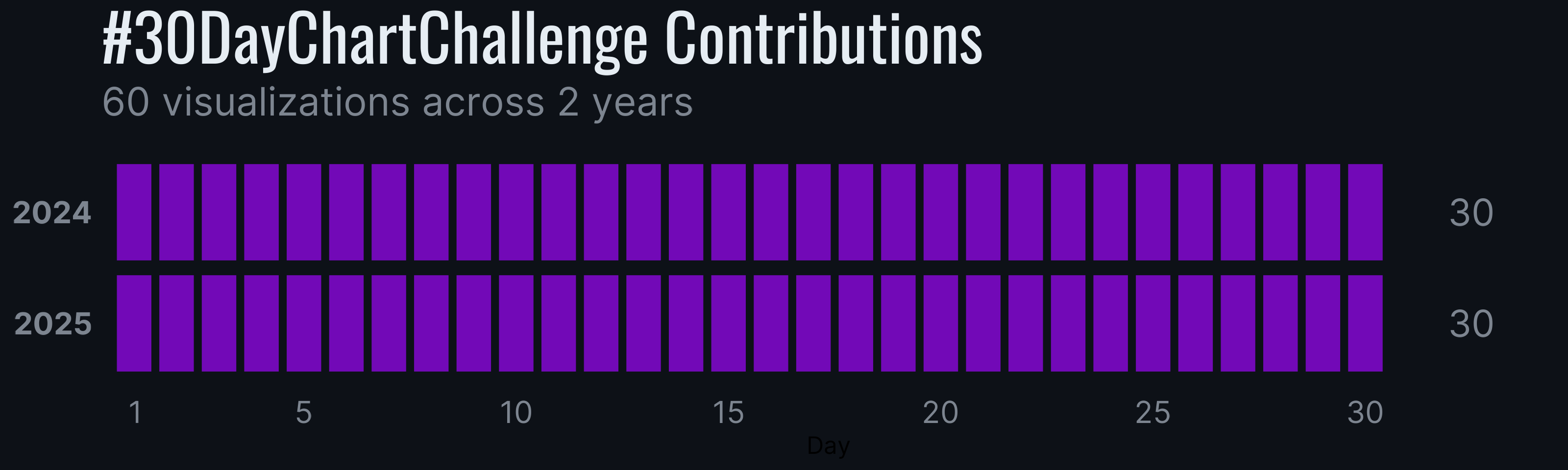
The heatmap below reflects my daily consistency across the challenge years.