

- 1️⃣ Overview
- 2️⃣ Installation
- 3️⃣ Usage
- 4️⃣ Configuration Guide
- 5️⃣ Examples
- 6️⃣ Contributing & Roadmap
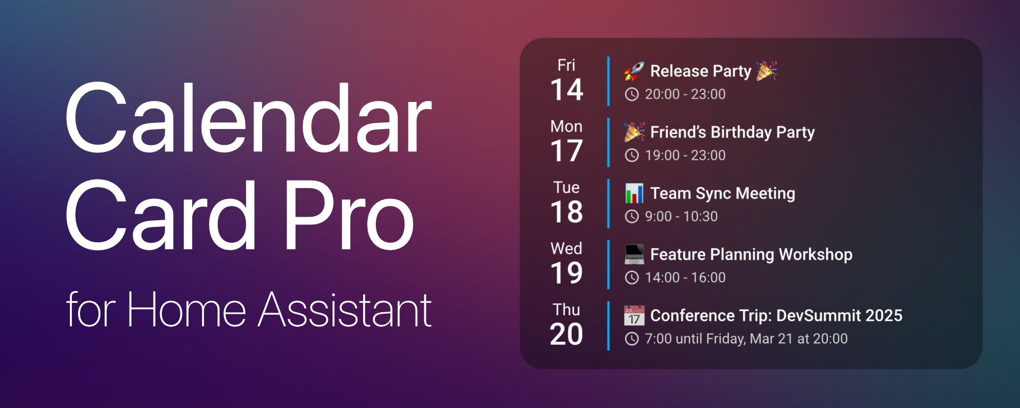
Calendar Card Pro was inspired by a beautiful calendar design using button-card and Hass calendar add-on shared in the Home Assistant community. While the original design was visually stunning, implementing it with button-card and card-mod led to performance issues.
This motivated me to create a dedicated calendar card that excels in one thing: displaying upcoming events beautifully and efficiently.
Built with performance in mind, the card leverages intelligent refresh mechanisms and smart caching to ensure a smooth experience, even when multiple calendars are in use.
- 🎨 Sleek & Minimalist Design – Clean, modern, and visually appealing layout.
- ✅ Multi-Calendar Support – Display multiple calendars with unique styling.
- 📅 Compact & Expandable Views – Adaptive views to suit different dashboard needs.
- 🔧 Highly Customizable – Fine-tune layout, colors, event details, and behavior.
- ⚡ Optimized Performance – Smart caching, progressive rendering, and minimal API calls.
- 💡 Deep Home Assistant Integration – Theme-aware with native ripple effects.
- 🌍 Multi-Language Support – Available in English and German (more to come).
- 🧩 Modular & Extensible – Designed for future enhancements and easy customization.
Calendar Card Pro requires at least one calendar entity in Home Assistant. It is compatible with any integration that generates calendar.* entities, with CalDAV and Google Calendar being the primary tested integrations.
The easiest way to install Calendar Card Pro is via HACS (Home Assistant Community Store).

- Ensure HACS is installed in Home Assistant.
- Go to HACS → Frontend → Custom Repositories.
- Add this repository:
https://github.com/alexpfau/calendar-card-pro - Install Calendar Card Pro from HACS.
- Clear your browser cache and reload Home Assistant.
📖 Click to expand manual installation instructions
-
Download the latest release:
👉 calendar-card-pro.js -
Move the file to your Home Assistant
wwwfolder:
/config/www/ -
Navigate to: Home Assistant → Settings → Dashboards → Resources → Add Resource
-
Add the resource to your Lovelace Dashboard:
url: /local/calendar-card-pro.js
type: module
-
Clear cache & refresh your browser to apply changes.
Once Calendar Card Pro is installed, follow these steps to add and configure it in your Home Assistant dashboard.
-
Ensure a Calendar Integration is Set Up
Calendar Card Pro requires at least onecalendar.*entity in Home Assistant (e.g., Google Calendar, CalDAV). -
Open Your Dashboard for Editing
- Navigate to Home Assistant → Dashboard
- Click the three-dot menu (⋮) → Edit Dashboard
-
Add Calendar Card Pro
- Click the ➕ Add Card button
- Search for
"Calendar"or scroll to find"Calendar Card Pro" - Select the card to add it to your dashboard
-
Initial Setup & Configuration
- By default, the card will automatically detect available calendars and select the first one.
- Use the YAML mode for advanced customization.
Calendar Card Pro offers a range of customization options to match your needs.
-
Control which events are displayed
- Set
days_to_showto define how many days are visible. - Use
max_events_to_showto limit the number of events in compact mode.
- Set
-
Customize colors, fonts, and layout
- Apply different colors per calendar using the
coloroption. - Adjust font sizes for event details, dates, and other elements.
- Modify separators and spacing for a personalized look.
- Apply different colors per calendar using the
-
Modify tap/hold actions
- Set
tap_actionandhold_actiontoexpand,navigate, or other HA-supported actions.
- Set
type: custom:calendar-card-pro
title: 'Upcoming Events'
entities:
  - entity: calendar.family
    color: '#e63946' # Custom color for family events
  - entity: calendar.work
    color: '#457b9d' # Custom color for work events
days_to_show: 5
max_events_to_show: 5
show_location: true- Explore the 📚 Configuration Guide for a detailed list of options.
- Check out the 💡 Examples section for pre-configured setups.
- Get involved! Check out the Contributing & Roadmap section to learn how to contribute and see upcoming features.
The following table provides an overview of all available configuration options.
| Name | Type | Default | Description |
|---|---|---|---|
| entities | array | Required | List of calendar entities with optional styling |
| days_to_show | number | 3 |
Number of days to display |
| max_events_to_show | number | - |
Maximum number of events to show in compact mode |
| show_past_events | boolean | false |
Show today's events that have already ended |
| language | string | System, fallback en |
Interface language (en, de) |
| time_24h | boolean | true |
Use 24-hour time format |
| show_end_time | boolean | true |
Show event end times |
| show_month | boolean | true |
Show month names |
| show_location | boolean | true |
Show event locations |
| remove_location_country | boolean | true |
Remove country from location |
| background_color | string | var(--ha-card-background) |
Card background color |
| row_spacing | string | 5px |
Spacing between calendar day rows |
| additional_card_spacing | string | 0px |
Additional top/bottom padding for the card |
| vertical_line_width | string | 2px |
Width of vertical separator line |
| vertical_line_color | string | #03a9f4 |
Color of vertical separator line & ripple effects |
| horizontal_line_width | string | 0px |
Width of horizontal separator line |
| horizontal_line_color | string | var(--secondary-text-color) |
Color of horizontal separator line |
| title | string | - |
Card title |
| title_font_size | string | 20px |
Card title font size |
| weekday_font_size | string | 14px |
Weekday font size |
| day_font_size | string | 26px |
Day number font size |
| month_font_size | string | 12px |
Month font size |
| event_font_size | string | 14px |
Event title font size |
| time_font_size | string | 12px |
Event time font size |
| location_font_size | string | 12px |
Location text font size |
| time_location_icon_size | string | 16px |
Size of time and location icons |
| title_color | string | var(--primary-text-color) |
Card title text color |
| weekday_color | string | var(--primary-text-color) |
Weekday text color |
| day_color | string | var(--primary-text-color) |
Day number text color |
| month_color | string | var(--primary-text-color) |
Month text color |
| event_color | string | var(--primary-text-color) |
Default event title color |
| time_color | string | var(--secondary-text-color) |
Event time text color |
| location_color | string | var(--secondary-text-color) |
Location text color |
| refresh_interval | number | 30 |
Minutes between auto-refresh of events |
| tap_action | object | { action: "none" } |
Action on tap/click |
| hold_action | object | { action: "none" } |
Action on long press |
The entities array accepts either:
- A simple entity ID (default styling applies)
- An advanced object configuration (custom styling per entity)
entities:
  - calendar.family # Simple entity ID (default styling)
  - entity: calendar.work # Advanced entity configuration
color: '#1e90ff' # Custom event color for this calendar- A simple string (e.g.,
calendar.family) will apply the card’s default styles. - An object with
entityand optional parameters allows customization per calendar:entity: The calendar entity ID (required).color: Custom event title color (optional) – Overrides the defaultevent_colorsetting.
By default, Calendar Card Pro displays all events for the next 3 days (including today). This means:
- If there are no events in the next 3 days, the card will show an empty state.
- If there are many events, all will be displayed, making the card taller.
- The card height adapts dynamically based on content.
- By default, past events from today are hidden, but you can set
show_past_events: trueto display them.
To control Calendar Card Pro's size, enable compact mode by setting max_events_to_show. This:
- Limits the number of events displayed at once.
- Maintains a consistent card height.
- Dynamically updates as new events appear.
You can toggle between compact and full views by configuring tap_action or hold_action.
Both tap_action and hold_action support the following options:
| Action Type | Description |
|---|---|
| expand | Toggles between compact and full view (when max_events_to_show is set). |
| more-info | Opens the More Info dialog in Home Assistant. |
| navigate | Navigates to a different dashboard view. |
| call-service | Calls a Home Assistant service. |
| url | Opens an external URL. |
Additional Parameters:
navigation_path: Path for navigate action.url_path: URL for url action.service: Home Assistant service for call-service action.service_data: Service payload for call-service action.
tap_action:
action: expandtap_action:
action: navigate
navigation_path: /lovelace/calendarCalendar Card Pro integrates Home Assistant’s native interaction patterns for a seamless experience:
- Ripple Effect – Provides visual feedback on hover and touch.
- Hold Actions – Displays a visual indicator when the hold threshold is reached.
- Keyboard Navigation – Fully supports Enter/Space for activation.
- Haptic Feedback – Aligns with Home Assistant’s design language.
Calendar Card Pro efficiently handles API calls and refreshes:
- Minimized API Polling – Fetches new data only when necessary.
- Automatic Refresh – Updates every
refresh_intervalminutes (default:30). - Smart Caching – Stores events locally with cache lifetime equal to the refresh interval.
- Rate-Limited Refresh – When manually refreshing the page, new data is fetched only if at least 5 seconds have passed since the last update, preventing excessive API calls.
- Reactive Updates – Events update when:
- A calendar entity changes.
- Home Assistant reconnects after a disconnection.
- The dashboard becomes active again.
To maintain performance, Calendar Card Pro progressively renders events:
- Renders events in small batches to prevent UI lag.
- Prevents browser freezing with optimized rendering.
- Ensures smooth interactions even for large event lists.
This section provides different configuration setups to help you get started with Calendar Card Pro.
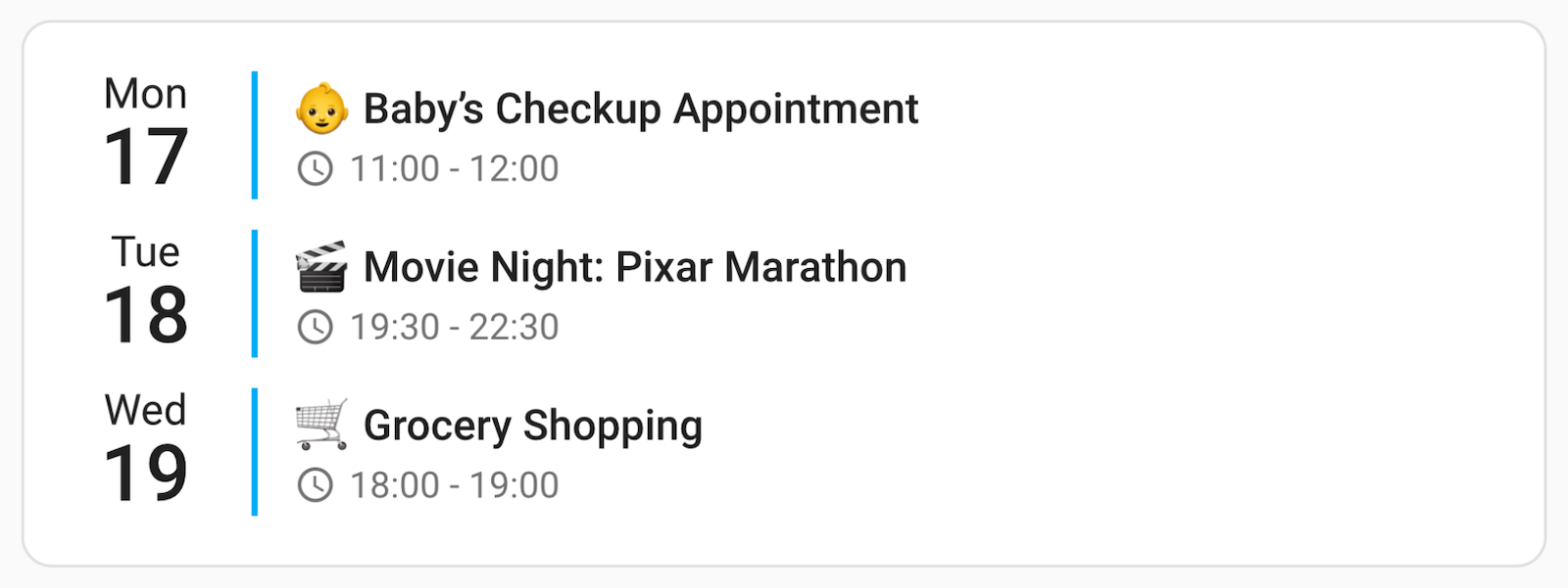
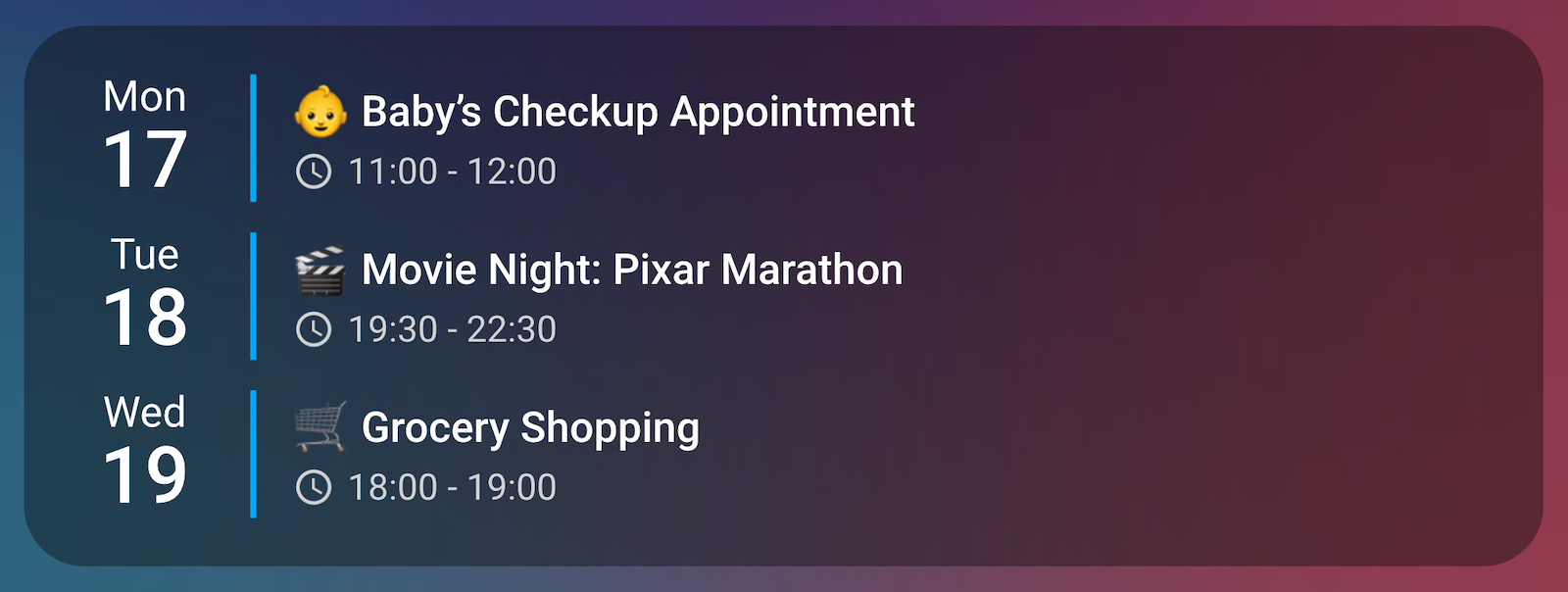
A simple setup displaying events from a single calendar. Automatically adapts to themes and dark/light mode.
With Home Assistant default theme (light mode):
Using my favorite iOS Theme (ios-dark-mode-blue-red-alternative):
type: custom:calendar-card-pro
entities:
  - calendar.family
days_to_show: 3
show_location: false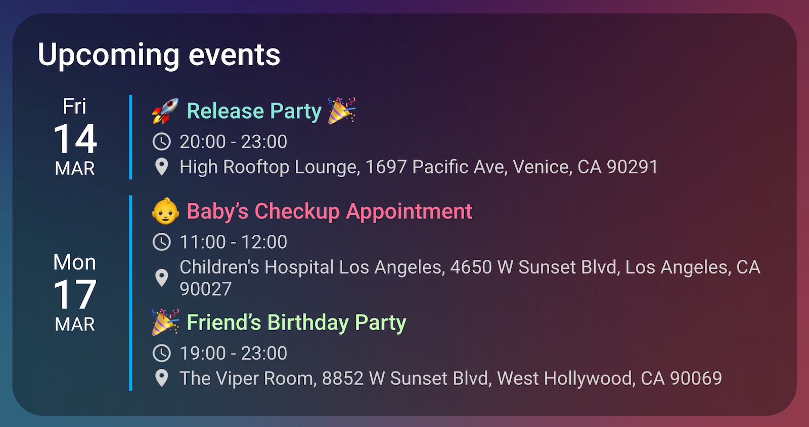
show_month: falseThis setup includes multiple calendars, each with a custom color. The compact mode ensures that only a limited number of events are shown at once. Screenshots again showing my favorite iOS Theme (ios-dark-mode-blue-red-alternative).
Compact view:
After tap ➡️ expanded view:
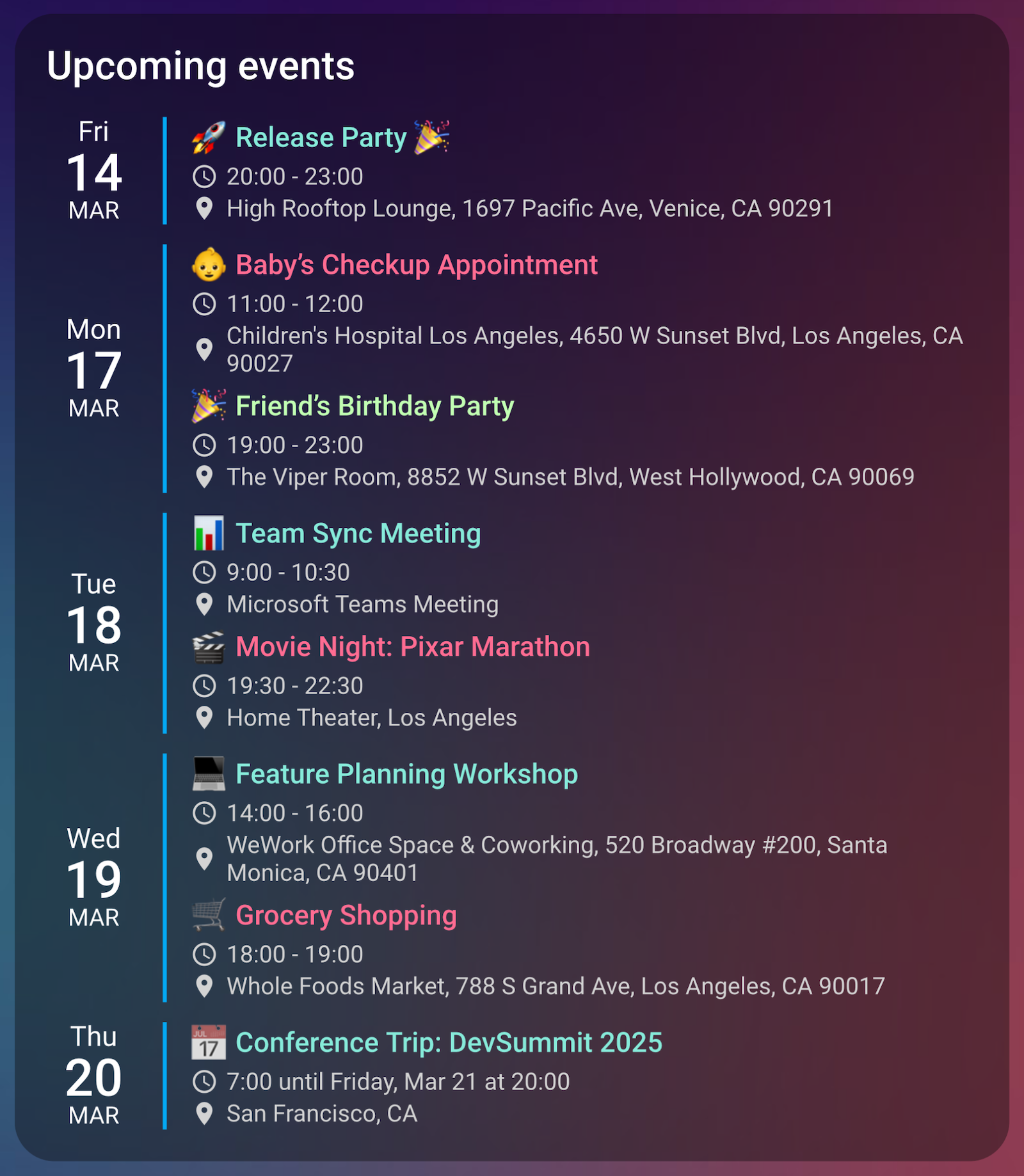
type: custom:calendar-card-pro
title: Upcoming events
entities:
  - entity: calendar.family
    color: '#ff6c92' # Red for family events
  - entity: calendar.work
    color: '#86ebda' # Blue for work events
  - entity: calendar.personal
    color: '#c2ffb3' # Green for personal events
days_to_show: 7
max_events_to_show: 3 # Always only show 3 events
tap_action:
action: expand # Tap to expand/collapseA fully customized configuration demonstrating all available options, including styling, layout, and interactions. Though you could go all out—and I didn’t—and create a completely different look if you wanted. Screenshot using the beautiful Bubble Theme.

type: custom:calendar-card-pro

# Core Settings
entities:
  - entity: calendar.family
    color: '#ffdaea'
  - entity: calendar.work
    color: '#b3ffd9'
days_to_show: 10
max_events_to_show: 10
show_past_events: false

# Display Mode & Localization
language: en
time_24h: true
show_end_time: true
show_month: true
show_location: true
remove_location_country: true

# Card Layout
title: 📅 Full Calendar Demo
background_color: '#eeeeee50'
row_spacing: 10px
additional_card_spacing: 0px

# Visual Separators
vertical_line_width: 0px
vertical_line_color: '#baf1ff'
horizontal_line_width: 2px
horizontal_line_color: '#baf1ff80'

# Typography: Sizes
title_font_size: 26px
weekday_font_size: 14px
day_font_size: 32px
month_font_size: 12px
event_font_size: 14px
time_font_size: 12px
location_font_size: 12px
time_location_icon_size: 14px

# Typography: Colors
title_color: '#baf1ff'
weekday_color: '#baf1ff'
day_color: '#baf1ff'
month_color: '#baf1ff'
event_color: '#baf1ff'
time_color: '#baf1ff'
location_color: '#baf1ff'

# Performance & Caching
refresh_interval: 15 # Auto-refresh events every 15 minutes

# Actions
tap_action:
  action: expand
hold_action:
  action: navigate
  navigation_path: calendar
Want to improve Calendar Card Pro? I welcome contributions of all kinds—whether it’s fixing bugs, improving performance, or adding new features!
- Fork this repo and clone it locally.
- Install dependencies:
npm install
- Start development:
npm run dev
- Open a Pull Request with your changes.
💡 For detailed contribution guidelines, see CONTRIBUTING.md.
I am continuously working on improving Calendar Card Pro. Here’s what’s planned for upcoming releases:
- Enhanced Event Details – Support for event descriptions, recurring event indicators, and more.
- Visual Configuration Editor – Configure all options through an intuitive UI without writing YAML.
- Expanded Language Support – Adding more languages (looking for community translations).
💡 Got a feature request? Open a GitHub Issue or start a discussion!
For those interested in contributing code, I maintain detailed architecture documentation that explains:
- Code Organization – Structure and module responsibilities.
- Data Flow & Processing – How events are fetched, stored, and displayed.
- Performance Optimization – Techniques for fast rendering and caching.
- Design Principles – Best practices for UI consistency and accessibility.
Calendar Card Pro currently supports:
- English (
en) - German (
de)
To add a new language:
- Create a new file in
src/translations/languages/[lang-code].json - Copy the structure from an existing language file.
- Translate all strings to your language.
- Submit a Pull Request with your changes.
- Original design inspiration from Calendar Add-on & Calendar Designs by @kdw2060.
- Interaction patterns inspired by Home Assistant’s Tile Card, which is licensed under the Apache License 2.0.
- Material Design ripple interactions, originally by Google, used under the Apache License 2.0.